
Join 1,000s of professionals who are building real-world skills for better forecasts with Microsoft Excel.
Issue #43 - Forecasting with Excel Part 6:
The Power of Python
This Week’s Tutorial
If you're serious about building better forecasts using Microsoft Excel, then you should be excited about the biggest upgrade in Excel's history - the ability to run formulas written in Python.
Python in Excel is a game-changer for millions of professionals wanting to unleash the power of their data.
Not only does access to Python provide you with powerful ways to build better forecasts, but you also get access to a host of advanced analytics, like:
Machine learning predictive models
Mining free-form text
Cluster analysis
This week's tutorial shows you just a small sample of what's possible for your forecasting when you embrace Python in Excel.
If you would like to follow along with today's tutorial (highly recommended), you will need to download the SalesTimeSeries.xlsx file from the newsletter's GitHub repository.
You will also need, of course, access to Python in Excel.
Preparing the Data
When using Python in Excel, it's best to organize your Python formulas (i.e., code) to make writing and maintaining your data goodness easier.
I'm a big fan of putting all of my Python formulas in a single worksheet, where the code is laid out step-by-step vertically. First step is to add a worksheet:

Next, I add comments to my Python worksheets for my own long-term sanity:

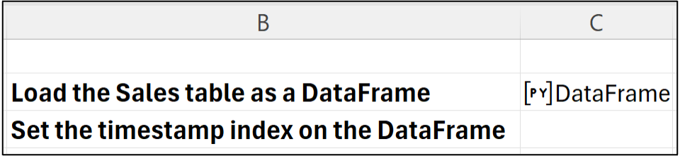
I then place my Excel formulas immediately to the right of each comment. In this case, I would click on cell C2 to hold the Python formula for loading the Sales table.
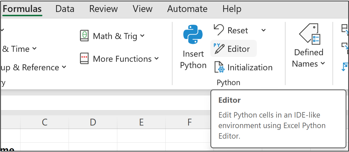
The best way to write Python formulas is to use the new Python Editor, which you can access from the Ribbon:
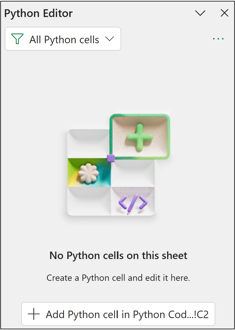
Clicking the Python Editor opens a new pane:
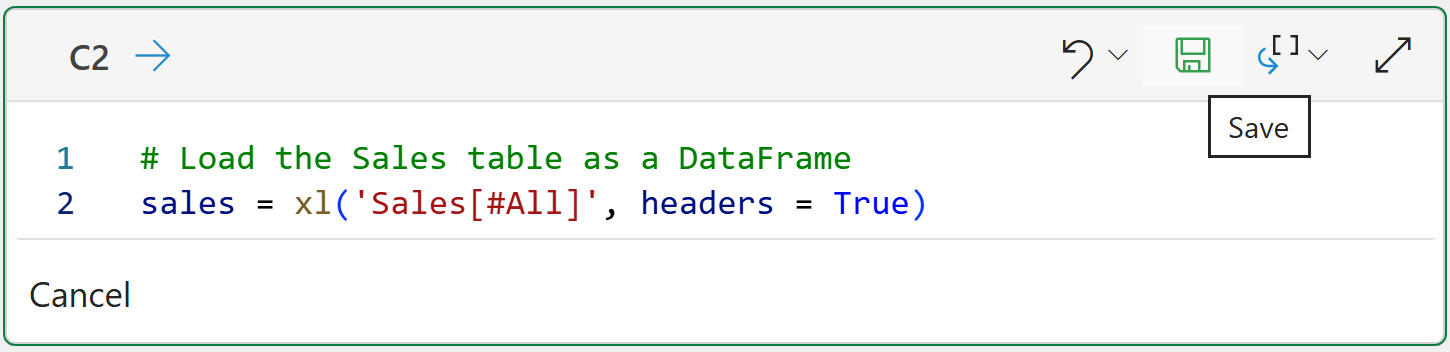
Notice how the button in the bottom of the Python Editor references cell C2? Clicking the button inserts a new Python formula in that cell where you write your code:

The code in the image above loads the Sales table from Excel into a Python DataFrame (i.e., how Python represents entire data tables).
Clicking the disk icon will save (i.e., run) the Python formula:
If you enter the code correctly, you should get a new DataFrame:

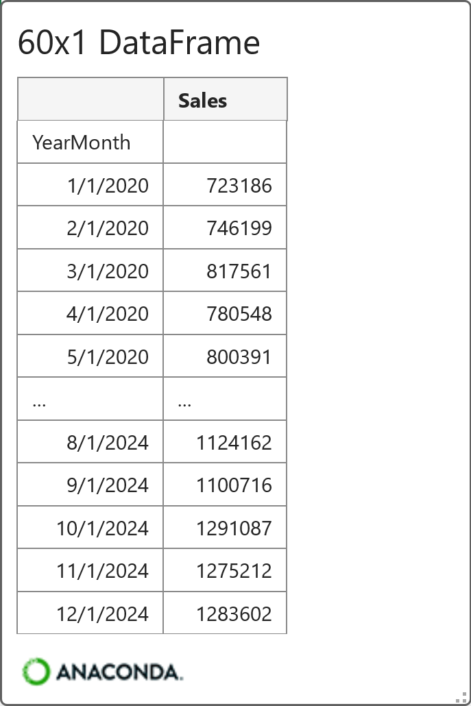
Clicking on the > in the Python Editor gives you a preview of the DataFrame:
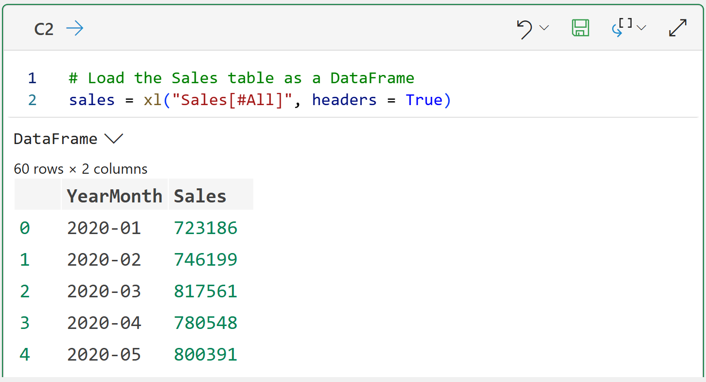
The above output shows that there are 60 rows of data (i.e., 5 years of monthly sales) and two columns: YearMonth and Sales.
When forecasting with Python in Excel, you usually need to format your DataFrames in a particular way:
Your timestamps have to be recognized by Python.
The DataFrame is indexed by the timestamp.
The YearMonth column isn't recognized by Python as a timestamp because Excel didn't recognize it as a timestamp. However, this is easily fixed by adding another Python formula to the worksheet:
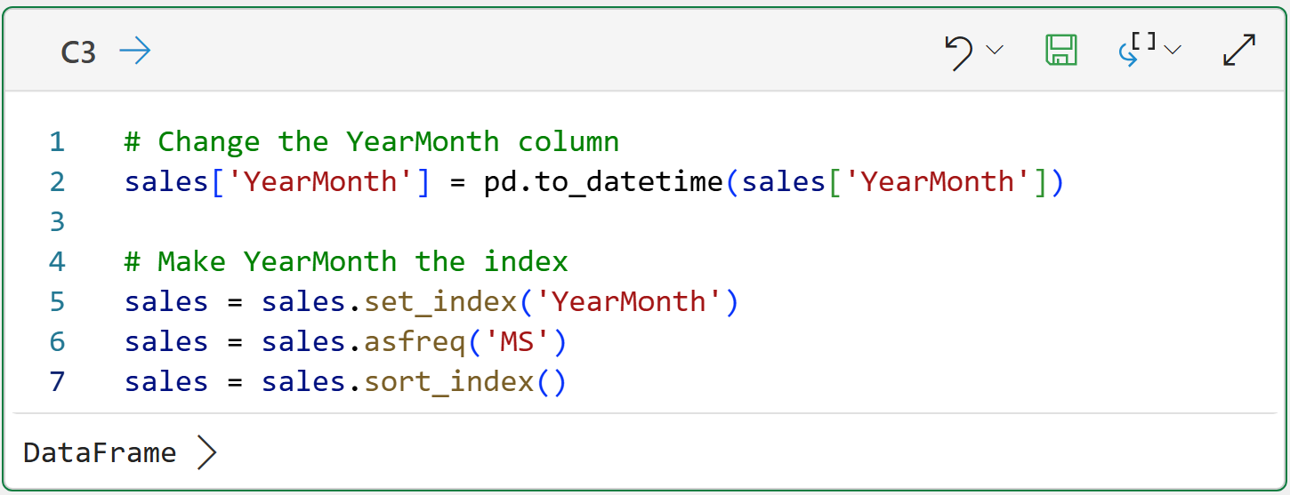
Conceptually, the Python formula in cell C3 sets up the DataFrame to have an index based on the YearMonth column, where each value corresponds to the first day of each month.
You can think of a DataFrame index as providing a unique identifier for each row in the table. You can see this in action by hovering over the [PY] in cell C3 and clicking on the card:

Excellent!
With the data now prepared for time series forecasting, here's the first thing you'll want to do - check to see if there's a trend and/or seasonality in the data.
Detecting Trend and Seasonality
As you learned in Part 2 of this tutorial series, detecting trend and seasonality is a critical aspect of building better forecasts. You also learned some simple techniques for utilizing native Excel features to accomplish this.
Python in Excel offers you something so much more powerful: Season-Trend decomposition using Loess (STL).
Python in Excel comes with the mighty statsmodels library. Think of statsmodels as a collection of functions that you can use to access powerful tools to build better forecasts. In most cases, better forecasts than are possible using native Excel features.
Accessing the power of STL is simple using Python in Excel:
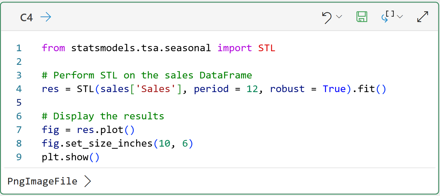
The Python formula in cell C4 tells STL to analyze the Sales column and that the data is monthly (i.e., period = 12). Also, the robust = True tells STL to use a version that is robust to some form of outliers.
The formula also creates a visualization (i.e., plot) of the results for ease of analysis, specifying to create a visual that is 10 inches wide and 6 inches high.
Clicking the > in the Python Editor provides the visual:

The above plots clearly show that the time series has a steady upward trend and pronounced seasonality (e.g., a dip in sales every January).
If you're serious about building better forecasts, you want STL in your tool belt.
If that wasn't enough, the statsmodels library has a lot more reasons why you want to be using Python in Excel to build your forecasts.
Forecast KPIs
You learned about measuring the accuracy of your forecasts in Part 3 of this tutorial series using the bias and MAE calculations.
When using Python in Excel, it's handy to have a function to calculate and display these KPIs for you:

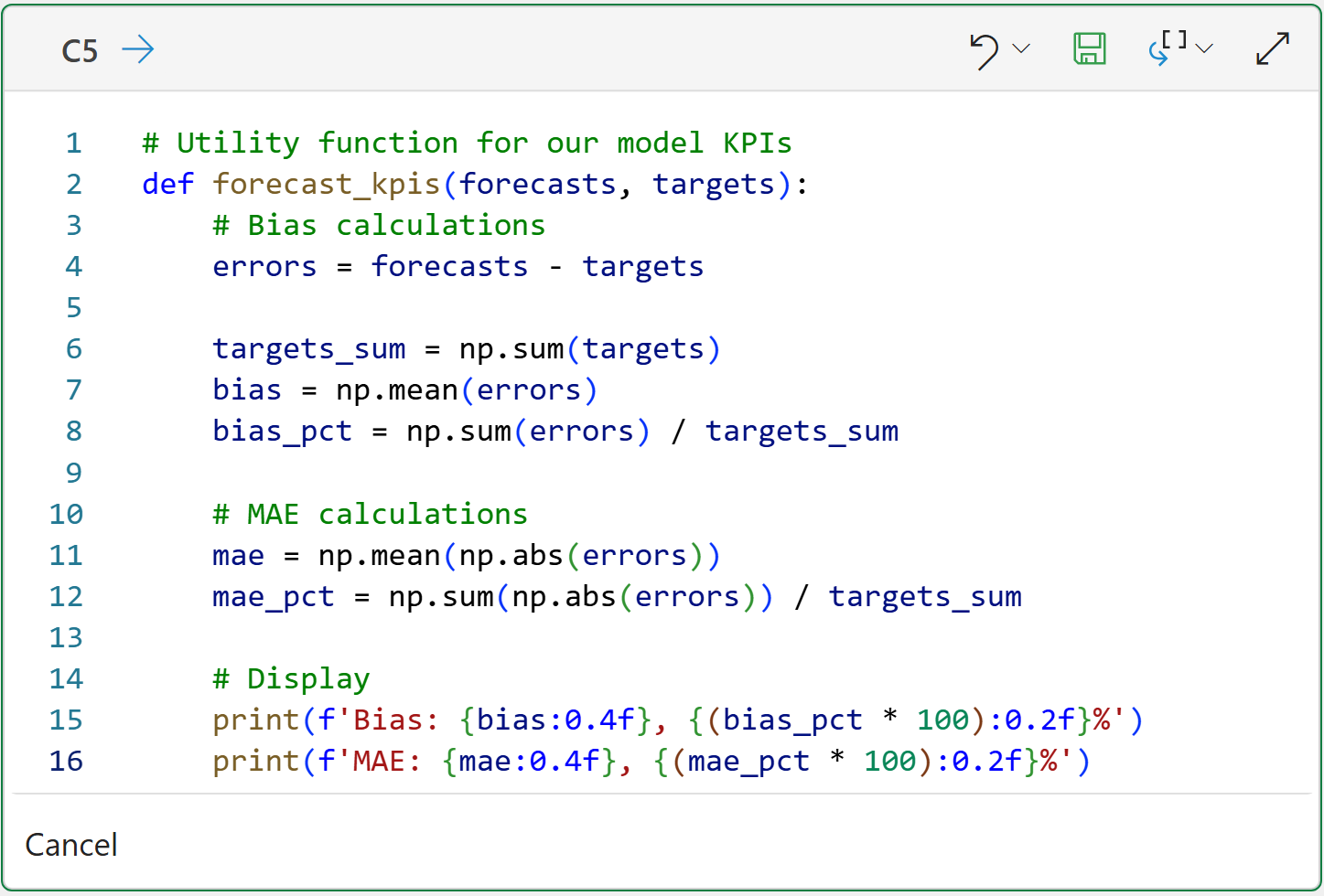
BTW - I only write the above utility function once and then copy and paste it into my Excel workbooks as needed.
Better Exponential Smoothing
The ETS in the function name stands for exponential triple smoothing and it should come as no surprise that the mighty statsmodels library also supports ETS.
It should also not be surprising that using statsmodels provides you with more opportunities for better ETS forecasts than what is provided by Excel.
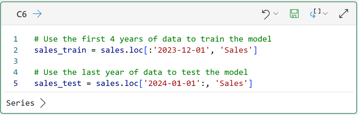
By using Python in Excel, you get more fine-grained control over the forecasting model, as you will see in this tutorial. First up, as you learned in Part 4, the data needs to be split:

With the data split, building an exponential triple smoothing model is straightforward:

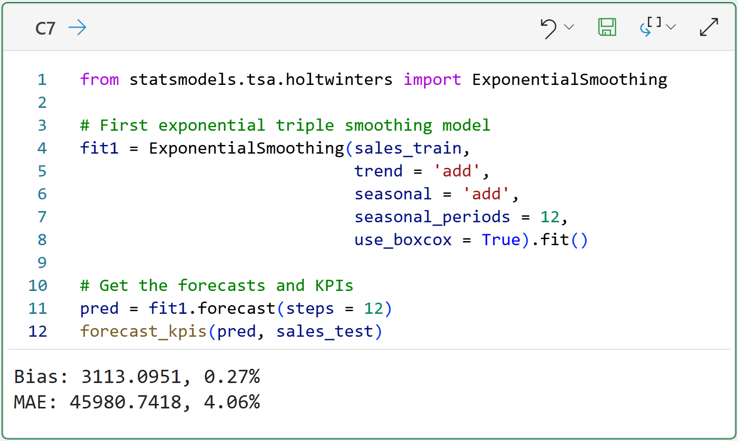
At a high level, there are three things to note about the above code:
The code uses trend = 'add' and seasonal = 'add' to align to Excel's FORECAST.ETS() function.
The seasonal_periods = 12 indicates that the data is at the monthly grain.
The use_boxcox = True adds a bit of transformation to the data before the model is built. FORECAST.ETS() is more forgiving than statsmodels, so this is required.
As detailed in Part 5, the above KPIs are an improvement over using FORECAST.ETS():
The magnitude of the bias improved from -1.06% to 0.27%.
The MAE improved from 4.68% to 4.06%.
Excel's FORECAST.ETS() function uses additive trends and seasonality with exponential smoothing.
However, exponential smoothing also supports multiplicative trends and seasonality. In some scenarios, multiplicative trends and seasonality produce better forecasts:


As shown above, the multiplicative exponential smoothing model is a slight improvement in MAE compared to the additive model.
This Week’s Book (Sort Of)
To my knowledge there's no book covering the statsmodels library, so I'm breaking with tradition to call out the statsmodels User Guide from the library's website:

Make no mistake. The statsmodels library is a great reason to get started with Python in Excel - especially if you want to build better forecasts.
That's it for this week.
Next week's newsletter will show you another reason why you want to build better forecasts using Python in Excel - incorporating external drivers.
Stay healthy and happy data sleuthing!

Dave Langer
Whenever you're ready, here are 3 ways I can help you:
1 - The future of Microsoft Excel forecasting is unleashing the power of machine learning using Python in Excel. Do you want to be part of the future? Order my book on Amazon.
2 - Are you new to data analysis? My Visual Analysis with Python online course will teach you the fundamentals you need - fast. No complex math required, and Copilot in Excel AI prompts are included!
3 - Cluster Analysis with Python: Most of the world's data is unlabeled and can't be used for predictive models. This is where my self-paced online course teaches you how to extract insights from your unlabeled data. Copilot in Excel AI prompts are included!