
Join 1,000s of professionals who are building real-world skills for better forecasts with Microsoft Excel.
Issue #40 - Forecasting with Excel Part 3:
Measuring Accuracy
This Week’s Tutorial
Forecasts are used to make some of the biggest decisions within organizations. Often these decisions involve many millions of dollars of spend:
Should we build a new factory?
Should we open new stores?
Should we cut budgets?
The list goes on and on.
The last thing you want to do is base these critical decisions on a forecast that isn't accurate.
In this week's tutorial, you will learn about two simple (but powerful) measures for assessing the accuracy (i.e., quality) of your forecasting models.
If you would like to follow along with today's tutorial (highly recommended), you will need to download the SalesTimeSeries.xlsx file from the newsletter's GitHub repository.
A Simple Model
As covered in the last tutorial of the series, I'm going to use a 6-month moving average model to provide the baseline forecasts for the rest of this tutorial series.
Here's how to calculate the forecasts using the Sales table from the tutorial's Excel workbook:
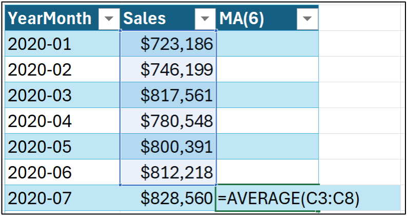
Dragging the formula down the length of the table populates all the forecasts:
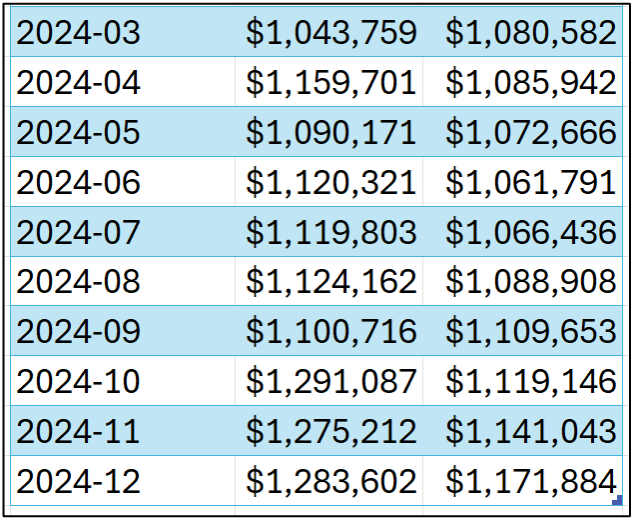
I'm going to use the above forecasts in the accuracy measure calculations in this tutorial.
Your Model's Bias
When considering the accuracy of a forecasting model, here's a fundamental question that needs to be answered:
"Are the forecasts typically too high or too low?"
This question goes to what is called the bias of the model, and there is a calculation that can tell you how biased your model is, on average.
Not surprisingly, the first thing you need to assess the bias of a forecast model is the forecast errors.
BTW - Other terms for the error are residual and noise.
Despite what term you use, calculating errors is simple. You subtract the target from the forecast:

And dragging the calculation down the length of the table:
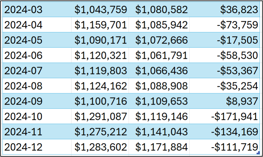
As you can see in the image above, the forecasts are both too high (e.g., an error of $36,823 for March 2024) and too low (e.g., -$111,719 in December 2024).
While you can examine/analyze the individual error values, the bias calculation aims at providing a key performance indicator (KPI) for a forecast model's predictive performance.
Intuitively, the bias KPI is just the average error:
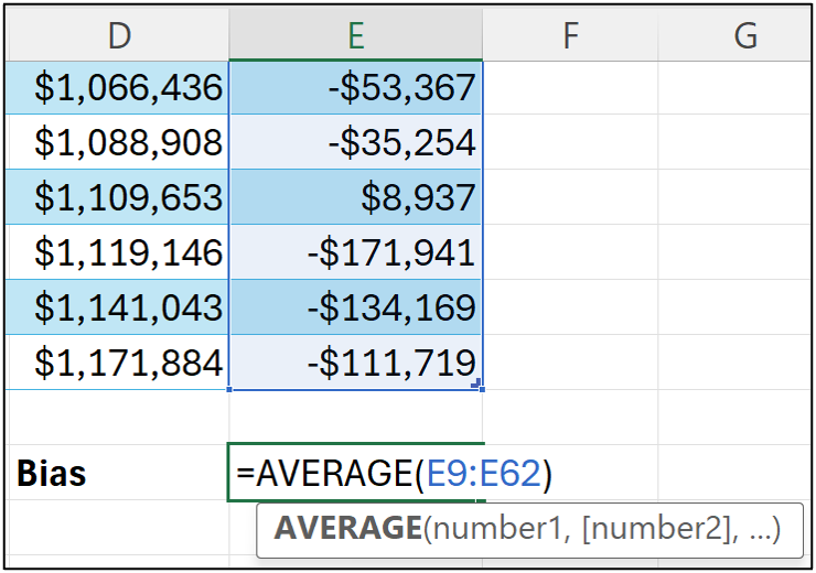
Think of the calculation in cell E64 of the Sales worksheet as combining all the forecasts and telling you, on average, if the forecasts are too low or too high:
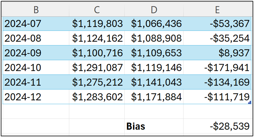
The bias calculation shows that the MA(6) forecast model tends to make forecasts that are, on average, too low.
Unfortunately, the value of -$28,539 isn't super informative by itself.
For example, -$28,539 doesn't tell you if the bias is very large compared to the targets in your time series.
What can be more informative is calculating the bias percentage (what is often called the scaled bias):
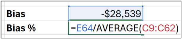
Here's what's going on in the bias % calculation - the average error is being divided by the average value of all the targets.
Here's the bias % for the MA(6) forecasting model:
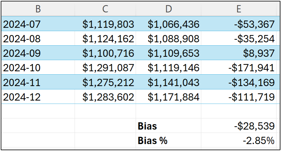
The bias % provides a better insight into how a model's bias relates to the magnitude of the targets being forecasted.
In this case, the MA(6) model forecasts are, on average, 2.85% too low.
Your Model's "Accuracy"
It might have occurred to you that the bias calculation doesn't really align with the idea of accuracy.
And you'd be right to think that.
By way of analogy, consider what "accuracy" means when throwing darts at a dartboard when the target is the bullseye.
In this scenario, accuracy can be measured as the distance from the bullseye to where a dart landed on the dartboard (e.g., the distance would be zero when you hit the bullseye).
When thought of this way, it doesn't matter if the dart is too high or too low relative to the bullseye. All that matters is the distance.
Using this analogy, the mean absolute error (MAE) calculation represents how far away, on average, the darts are from the bullseye.
This makes MAE a very intuitive way to assess the quality of your forecasts that is also easily understood by business stakeholders.
Here's the MAE for the MA(6) forecasts:
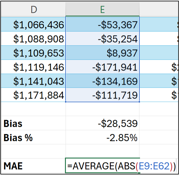
If you're unfamiliar, Excel's ABS() function stands for absolute value. Basically, think of this function as turning the negative errors into positive errors and leaving positive errors unchanged:

What the MAE calculation says about the MA(6) model that the forecasts are off by $60,656 on average.
Unlike the bias calculation, MAE can be quite informative by itself. For example, MAE can be used as a requirement for determining if a model will be useful in decision-making.
It can also be super useful to calculate the MAE % (i.e., scaled MAE):
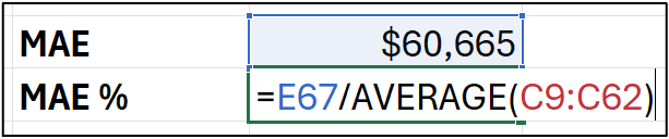
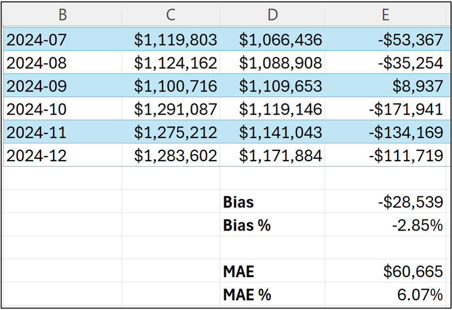
The MAE % is the average absolute error divided by the average target value and tells us that the forecasts are off by 6.07% on average.
However, MAE doesn't tell us if the forecasts are typically too high or too low.
That's what the bias tells us.
So, like chocolate and peanut butter, the combination of bias and MAE are better together when evaluating your forecasting models.
What About RMSE?
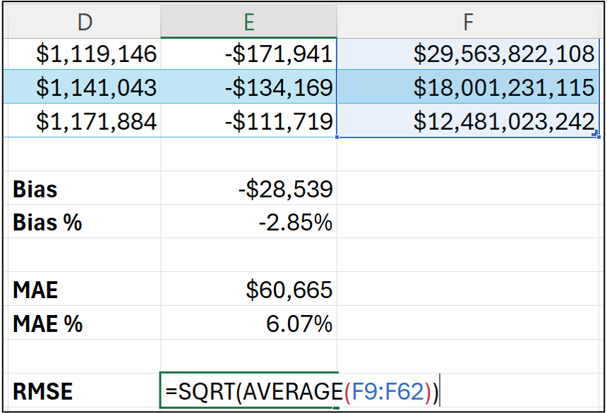
One last thing I will mention is that I also use another metric in evaluating forecasting models - root mean square error (RMSE).
The RMSE calculation is a little more complicated than bias and MAE. So, I rarely communicate this KPI to business stakeholders.
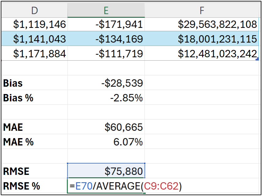
The first step is to calculate the squared errors of the forecasts:


Notice how the squared errors can get really large?
RMSE is designed to punish larger forecast errors when compared to MAE.
Imagine you have one forecast that is way off (i.e., a high error) and all the other forecasts are spot-on.
Because the MAE calculation averages the error, it can give a misleading representation of what's going on in these hypothetical forecasts.
Since RMSE punishes large errors more than small, this situation will be reflected in the RMSE KPI.
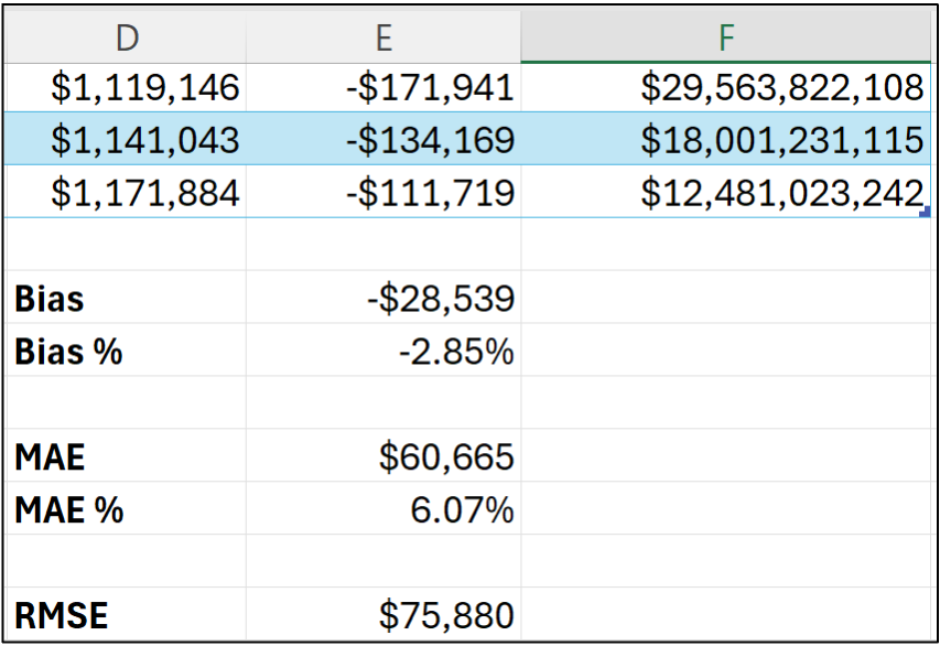
Next up is the final steps of the RMSE calculation:
Taking the average of the squared errors.
Taking the square root of the average (i.e., mean).
And scaling RMSE:
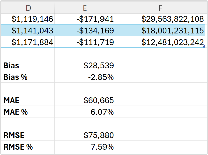
Since the interpretation of RMSE is somewhat mathematical, I'm going to discuss using RMSE from a practical perspective.
You can think of RMSE as measuring a different aspect of a model's forecasts as compared to MAE.
Unlike MAE, there isn't an intuitive direct understanding of RMSE. RMSE is most useful when comparing one forecasting model to another.
I will demonstrate using RMSE this way in a later tutorial.
Stay tuned.
This Week’s Book
You might be surprised to know that Microsoft Excel is the world's most popular tool for Prescriptive Analytics. This is a great book for unleashing the power of Solver on your business problems:
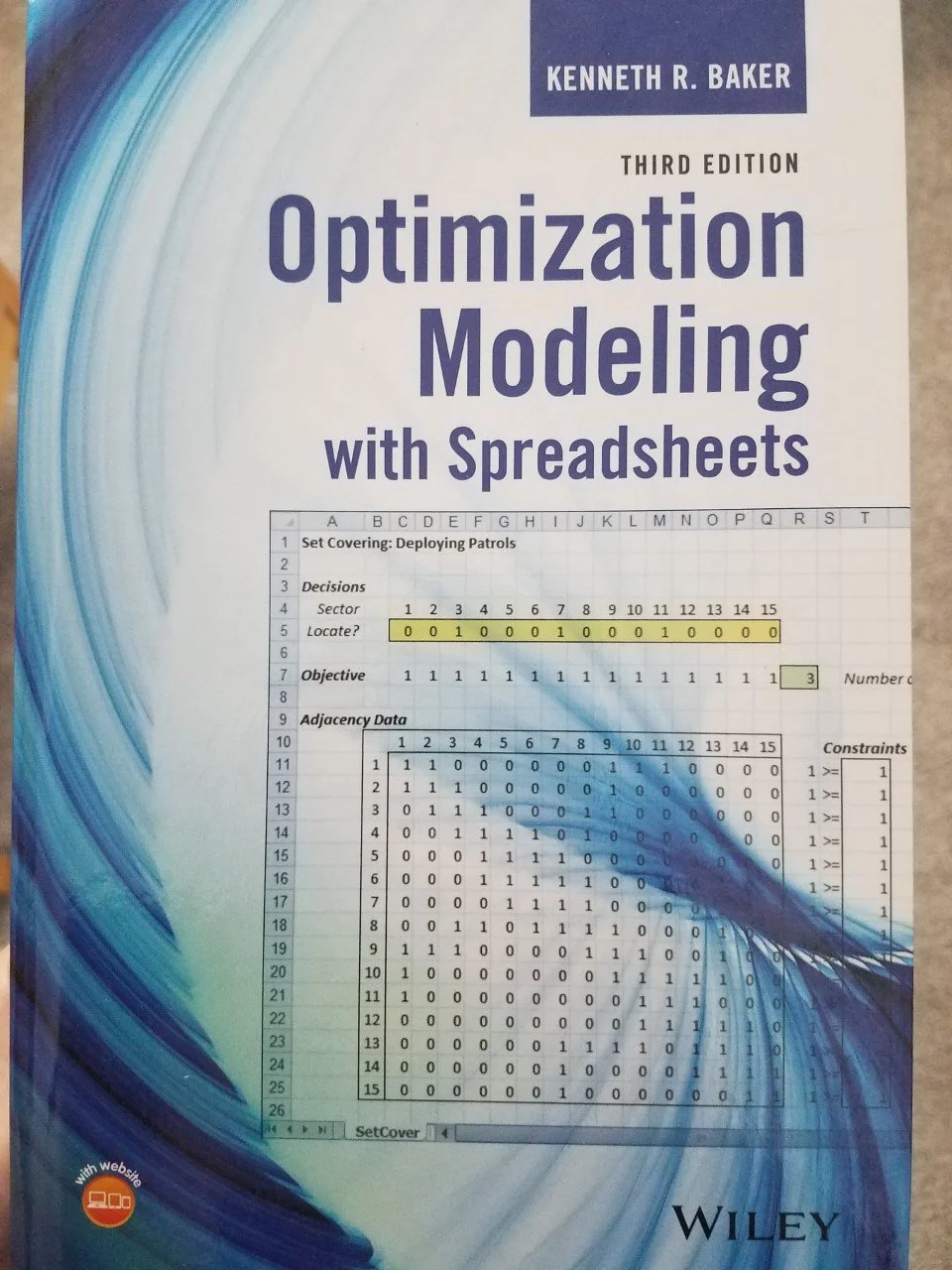
This book is particularly valuable if you work in supply chain management (e.g., inventory optimization), so check it out if you want to take your data game to the next level.
That's it for this week.
Next week's newsletter will discuss a critical aspect of building better forecasts - evaluating whether your forecasting model is any good.
Stay healthy and happy data sleuthing!

Dave Langer
Whenever you're ready, here are 3 ways I can help you:
1 - The future of Microsoft Excel forecasting is unleashing the power of machine learning using Python in Excel. Do you want to be part of the future? Order my book on Amazon.
2 - Are you new to data analysis? My Visual Analysis with Python online course will teach you the fundamentals you need - fast. No complex math required, and Copilot in Excel AI prompts are included!
3 - Cluster Analysis with Python: Most of the world's data is unlabeled and can't be used for predictive models. This is where my self-paced online course teaches you how to extract insights from your unlabeled data. Copilot in Excel AI prompts are included!