
Join 1,000s of professionals who are building real-world skills for better forecasts with Microsoft Excel.
Issue #59 - Text Mining with Python Part 6:
Sentiment Analysis
This Week’s Tutorial
I'm going to use a new dataset for this week's tutorial based on Kaggle's TripAdvisor Hotel Reviews dataset. Given the dataset's relatively large size, I will be using a random sample of the data.
Just so you know, everything you will be learning in this tutorial does scale to the full dataset in one of two ways:
If you're using Python in Excel, using a Power Query connection is a great option.
Unless otherwise noted, the Python code in this tutorial is 100% compatible with Jupyter Notebook.
I've added the HotelReviews.xslx Excel workbook to the newsletter's GitHub repository. As always, it is highly recommended that you follow along and write all the code.
NOTE - This tutorial will use a real-world dataset. It may contain "adult language." You've been warned!
What Is Sentiment Analysis?
You can think of sentiment analysis as a technique where you use a computer to analyze free-form text data and summarize the contents as being:
Positive
Negative
Neutral
As you might imagine, there are a tremendous number of real-world use cases for sentiment analysis:
Customer feedback
Social media (e.g., brand mentions)
Customer service interactions
Market research (e.g., competitor mentions)
And the list goes on.
While it's tempting to use AI tools like ChatGPT or Copilot to perform sentiment analysis, they have a major issue.
AI tools will not give you reproducible results. Running the same text through AI multiple times will very likely give you different outputs.
In this tutorial, you will learn to use Python in Excel to perform sentiment analysis in a reproducible way.
The Dataset
The HotelReviews.xlsx workbook contains the HotelReviewsTrain table:
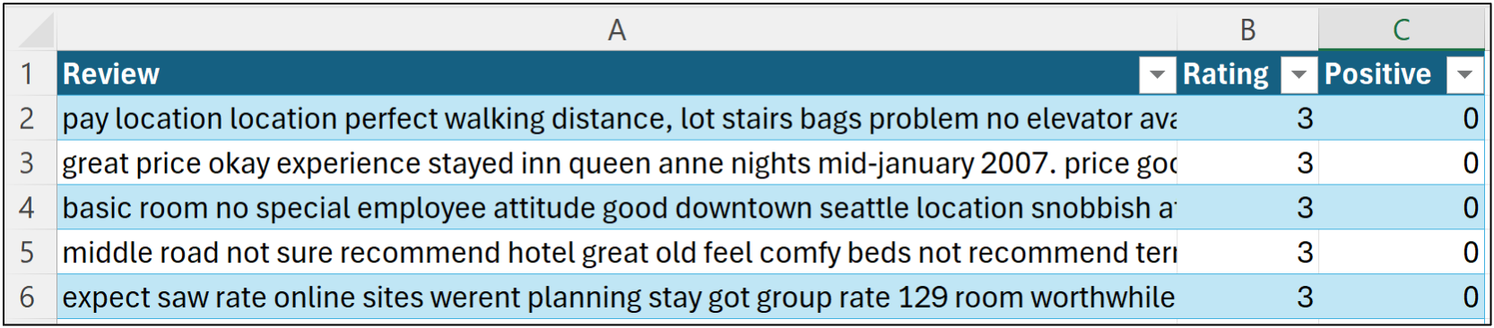
Here's how the data is organized:
The Review feature (i.e., column) contains the raw text of the hotel review.
The Rating feature contains the review's rating from 1 to 5 stars provided by the author.
The Positive feature is a binary indicator (i.e., 1 or 0) where the value is 1 if the Review is 4 or 5 stars and 0 otherwise.
The workbook also contains a HotelReviewsTest table in the event you would like to experiment with building a Naive Bayes classifier for predicting sentiment, as covered in Part 5 of this tutorial series.
Your New Friend - Vader
This tutorial will leverage the Valence Aware Dictionary and sEntiment Reasoner (VADER) for conducting sentiment analysis. From the VADER website:
VADER (Valence Aware Dictionary and sEntiment Reasoner) is a lexicon and rule-based sentiment analysis tool that is specifically attuned to sentiments expressed in social media.
Python in Excel includes the mighty Natural Language Toolkit (NLTK), and Microsoft has ensured that VADER is available for use via the NLTK's SentimentIntensityAnalyzer class.
VADER is super handy for any professional because not only does it support sentiment analysis for social media scenarios, but it also provides an informative breakdown for a piece of free-form text:
neg (negative) score
neu (neutral) score
pos (positive) score
compound score
And the best part, once again, is that using VADER gives you reproducible results you can share with your business stakeholders.
NOTE - The dataset used in this tutorial has been case-folded (i.e., all lowercase), so some information is lost. For example, VADER can detect shout case (e.g., THIS IS GREAT) and incorporate that information into its scoring.
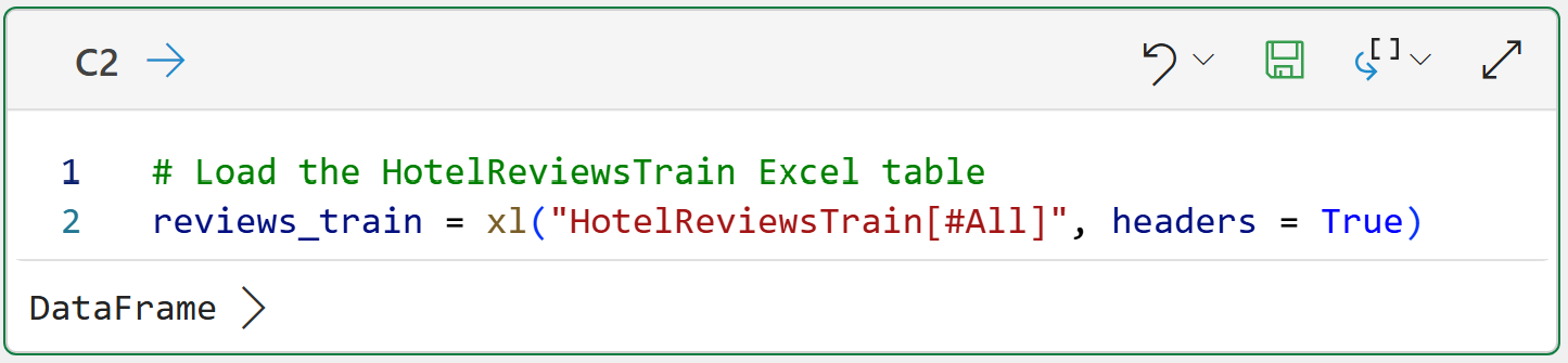
Loading the Data
Per my usual, I highly recommend you store all your Python formulas in a single worksheet and organize them vertically, including documentation:
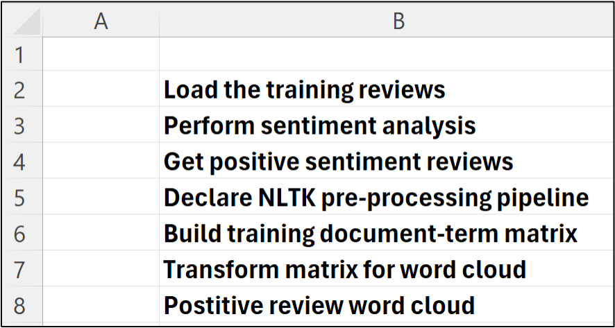
Then, place each Python in Excel formula to the right of your step-by-step documentation:
NOTE - The above is the only code in this tutorial that is specific to Python in Excel.
Using VADER for Sentiment Analysis
The NLTK provides the SentimentIntensityAnalyzer class, which uses VADER under the hood for sentiment analysis. Using this class is straightforward:
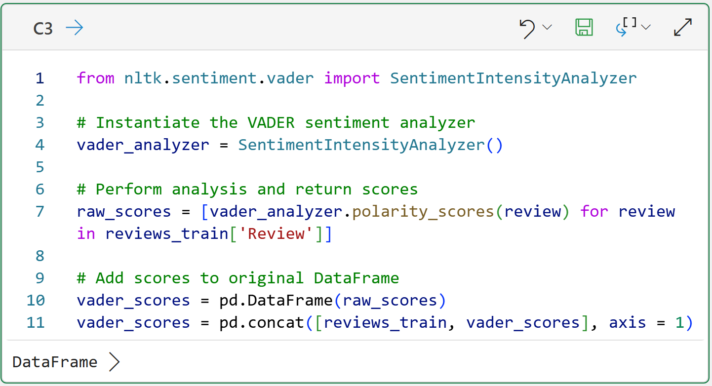
The magic in cell C3 happens on line 7 of the Python code. The code uses a list comprehension to pass each Review to VADER for scoring.
It's worth noting that VADER is designed to work with raw, free-form text. So, unlike previous tutorials, you don't need a text preprocessing pipeline to use VADER. In fact, as I mentioned above, raw text can provide more information to VADER (e.g., shout case).
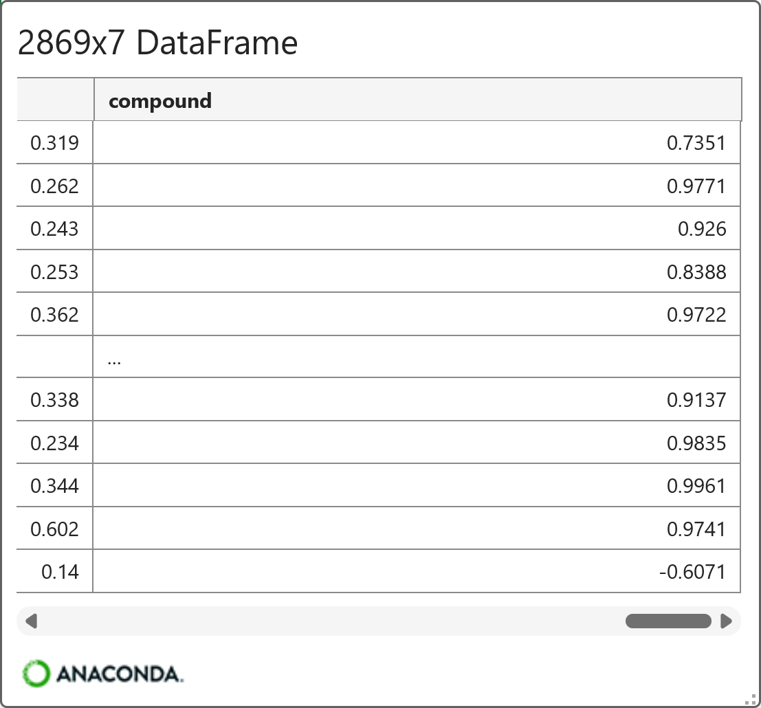
Lines 10 and 11 create a new DataFrame that combines review_train with the VADER scores. Clicking on the card by hovering your mouse over [PY] in the worksheet gives a preview:
When looking at the VADER compound scores, here's a framework for evaluation:
0.50 to 1.00: strongly positive
0.05 to 0.49: mildly to moderately positive
-0.04 to 0.04: neutral
-0.49 to -0.05: mildly to moderately negative
-1.00 to -0.50: strongly negative
Using the above framework, it's easy to filter the dataset for further analysis. For example, here's some code for filtering the data to only positive reviews and visualizing the relationship between the VADER compound score and the user-provided Rating:
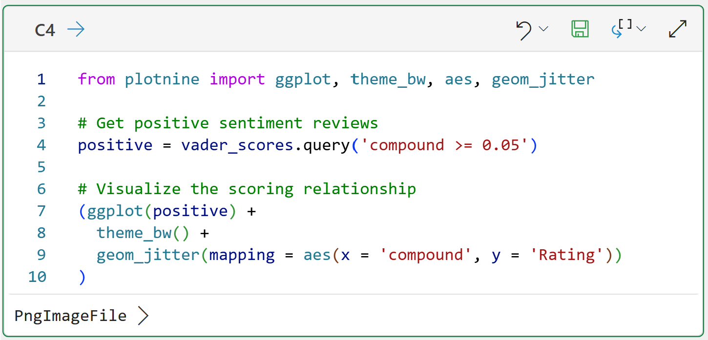
Clicking on the PngImageFile > displays the visual:
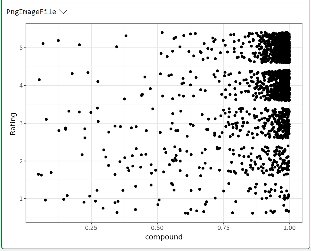
The above visualization was created using the mighty plotnine library. Over the years, plotnine has become my go-to Python library for data visualization because it's so easy to create visualizations that are useful for analytics.
The above is a prime example. Using geom_jitter() adds a bit of randomness to the data so points in the visualization are not stacked on top of each other.
BTW - My Python in Excel Accelerator online course includes a section on data visualization with plotnine.
The above visual shows that the VADER compound score doesn't always align with the user-provided Rating. For example, there are a number of 1- and 2-star ratings with high compound scores.
This is yet another example of a truism in analytics. Your analytics are rarely "correct." The real question is whether your analytics are good enough for better decision-making.
For example, it might be useful to understand which words are most commonly used in the reviews VADER scored as positive using a word cloud. This could assist in better decision-making.
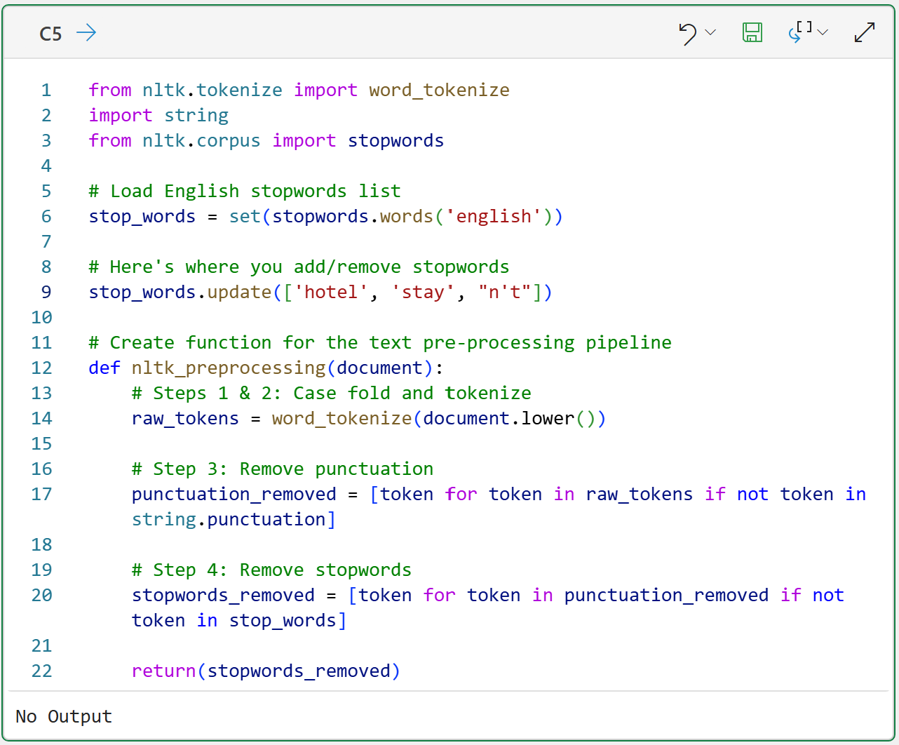
Text Preprocessing
As covered in Part 4 of this tutorial series, word clouds are simple visualizations you can use to understand token frequency in a collection of documents. However, unlike VADER, word clouds need a text pre-processing pipeline for maximum usefulness.
As I've covered the following code in previous tutorials, I won't repeat that content here for brevity:
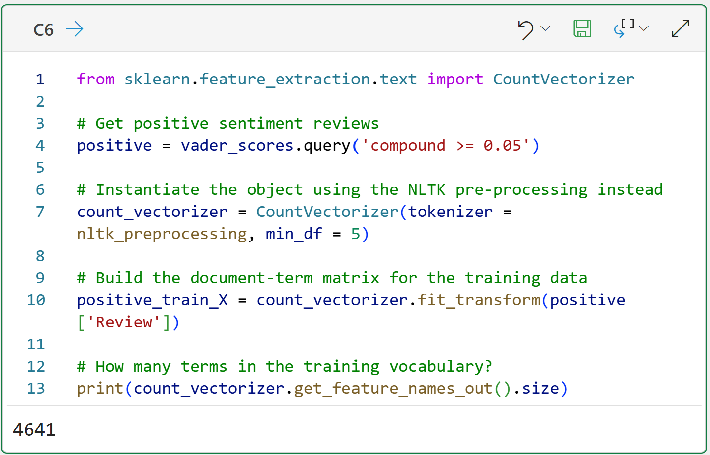
The code in cell C6 adds something new. The code on line 7 uses the parameter min_df = 5. This parameter tells the CountVectorizer to ignore tokens that appear in fewer than 5 Reviews. Using this parameter has two benefits:
It dramatically reduces the number of terms in the matrix (e.g., the output shows only 4,641 terms).
By eliminating rare terms from the matrix, your word clouds are more informative.
With the text preprocessed, it's time to build the positive reviews word cloud.
Building the Word Cloud
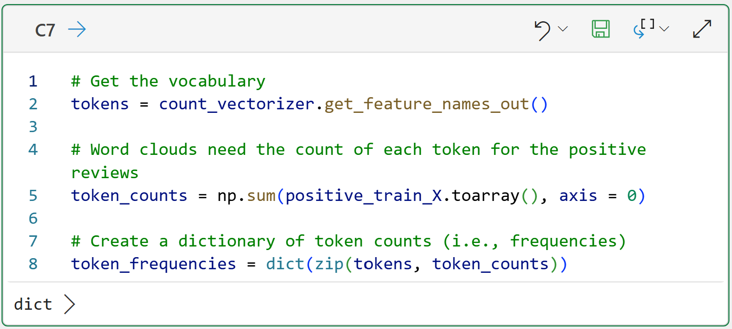
As covered in Part 4, the document-term matrix returned from the CountVectorizer can't be used directly to build a word cloud. Word clouds need the counts of tokens across all the documents.
The following code creates a Python dictionary where each key is a distinct term, and the value is the count of that term across all the positive reviews:
Next, the following code uses the dictionary to build the word cloud:
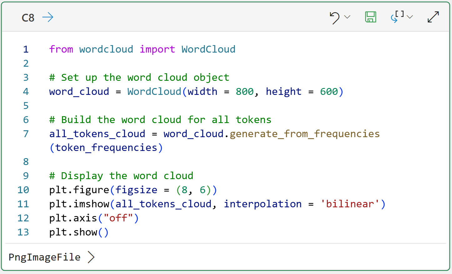
Clicking PngImageFile > displays the word cloud:
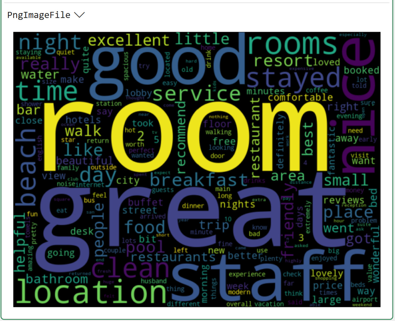
Take a look at the above word cloud and remember that the goal is to analyze what terms are associated with positive VADER sentiment scores:
The terms great, good, and nice are prominent (i.e., they are frequently used).
The terms room, staff, and location are also prominent.
While it makes sense that terms like great, good, and nice are prominent in the positive reviews, I would argue they aren't actually helpful for the analysis.
Therefore, words like this are prime candidates for being added to the stopwords list. I will leave it to you as a value-added exercise to add these to the code in cell C5 and see how the word cloud changes.
This Week’s Book
Many folks don't know this, but it's up to you to market your book as a technical author.
And, if you ever want to write another book, you'd better market regularly 🤣:

My book is designed to help ANY professional learn the Python foundation they need for analytics fast. Check out the 5-star reviews and save 23% off on Amazon's website.
That's it for this week.
My next newsletter will teach you how to mine your text data in another wildly useful way - fuzzy string matching.
Stay healthy and happy data sleuthing!

Dave Langer
Whenever you're ready, here are 3 ways I can help you:
1 - The future of Microsoft Excel is unleashing the power of do-it-yourself (DIY) analytics using Python in Excel. Do you want to be part of the future? My Python in Excel Accelerator online course will teach you what you need to know, and the Virtual Dave AI tutor is included!
2 - Are you new to data analysis? My Visual Analysis with Python online course will teach you the fundamentals you need - fast. No complex math required, and the Virtual Dave AI Tutor is included!
3 - Cluster Analysis with Python: Most of the world's data is unlabeled and can't be used for predictive models. This is where my self-paced online course teaches you how to extract insights from your unlabeled data. The Virtual Dave AI Tutor is included!