
Join 1,000s of professionals who are building real-world skills for better forecasts with Microsoft Excel.
Issue #49 - Forecasting with ARIMA Part 4:
Testing Your Models
This Week’s Tutorial
Forecasting is about predicting the future. But you don't have a time machine. So, how can you trust that your forecasts are accurate?
In this week's tutorial, you will learn how to test your models by simulating the future.
Unfortunately, most professionals (e.g., Finance pros) are not taught how to do this. This is your opportunity to stand out.
If you would like to follow along with today's tutorial (highly recommended), you will need to download the SalesTimeSeries.xlsx file from the newsletter's GitHub repository.
Simulating the Future
To build better forecasts, you must use your data to simulate the future. You do this by splitting your data into two sets:
The oldest data becomes what you use to build your forecasts.
The newest data becomes what you use to test forecast accuracy.
Here's why this strategy is critical to your forecasting success.
First, by using only the oldest data to build your forecasts, you are hoping to discover the underlying patterns that stand the test of time.
Imagine that you're forecasting sales and have 6 years of monthly data. You use the first 4 years to build and the last 2 years to test.
If your forecasts are accurate, you've found these patterns. But that's not all.
Second, consider a forecasting model that received the first 4 years of sales data.
From the model's perspective, the future starts with the first month of the test data (i.e., January of year five). This is how you simulate the future.
Is this simulation perfect?
Absolutely not. But it's the best you can do.
And, as I mentioned above, most professionals haven't been taught how to do it.
Splitting the Data
The Sales table of the tutorial Excel workbook has 5 years of monthly sales data.
While there is no magical equation that tells you how much data should be split between building your forecasting model (i.e., the training dataset) vs. the test dataset, here are some guidelines:
Each dataset set should include, at a minimum, one complete cycle of seasonality.
More data is better than less data.
As covered in Part 2, the Sales data exhibits yearly seasonality. Therefore, here are two reasonable approaches to splitting the data:
Use 3 years of data for training and 2 years for testing.
Use 4 years of data for training and 1 year for testing.
I will cover option 2 in this tutorial series. Try out option 1 and compare the results.
A Naive Forecasting Model
A forecasting best practice is to use a simple model to establish a baseline. Think of these simple forecasting models as establishing a goal that you want to beat with a more complex forecasting model (e.g., ARIMA).
One of the simplest forecasting models is the naive forecasting model. A naive forecasting model is simple to understand and use - it simply predicts the last known target.
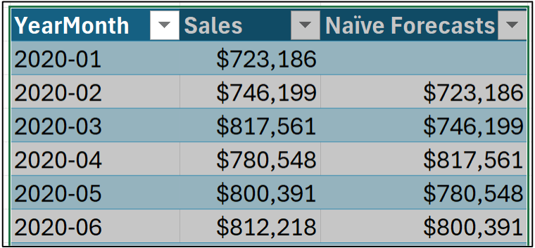
Using the tutorial workbook's Sales worksheet, you can set up a naive forecasting model like this:
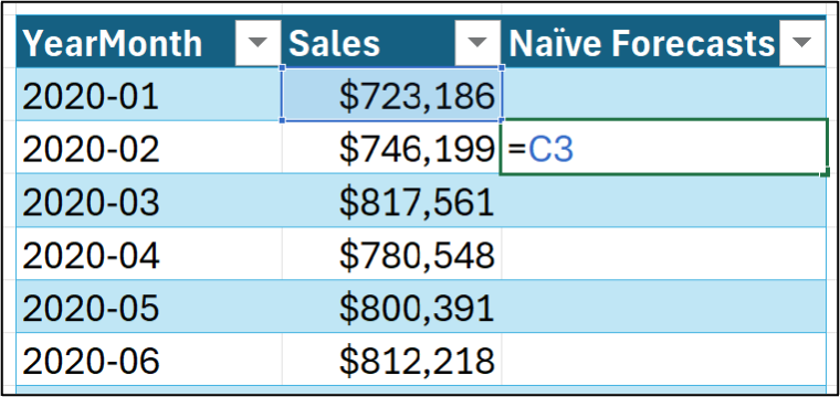
Hitting <enter> and dragging down the Sales table:
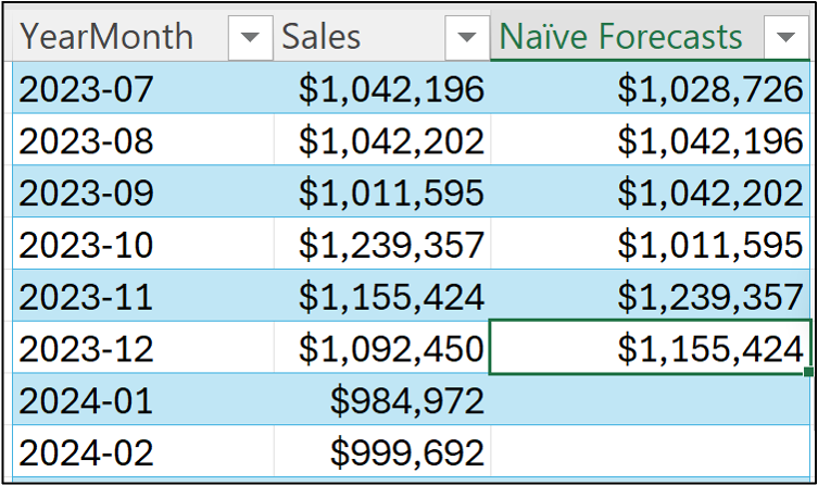
Notice in the image above how dragging the formula stops at December 2023? That's because I'm treating the 2024 data as the test dataset (i.e., the data that simulates the future).
All data before 2024 is used as the training dataset. You use the training dataset to build the most accurate forecasting model you can. Then, not surprisingly, you use the model to forecast each month in the test dataset.
By comparing the model's forecasts to the test dataset targets, you can estimate how well your model will do in the real world.
Visualizing the Naive Forecasting Model
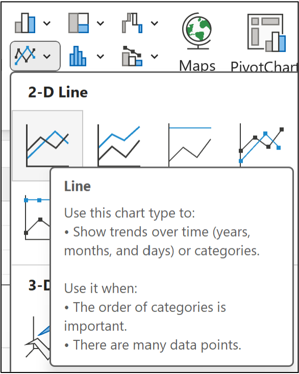
Data visualizations can help build intuition for how a forecasting model works. Your go-to visualization for forecasting is the mighty line chart.
First, select all the data in the Sales table through December 2023:
Next, from the Excel Ribbon, navigate to Insert -> Charts -> Line:
I've modified the line chart slightly to make it easier to read, but this isn't required:
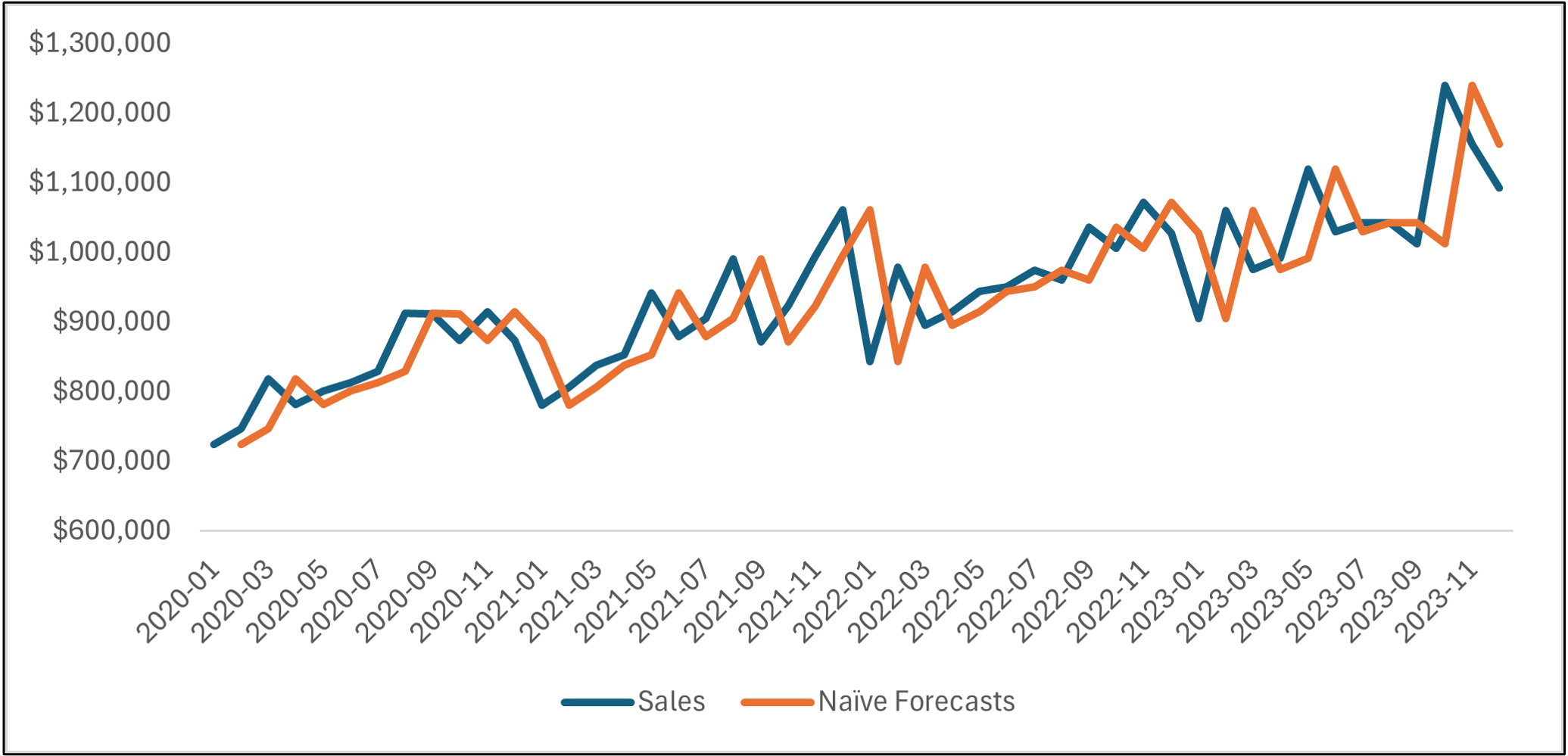
Take a look at the line chart above. The orange line is the naive forecasts, and the blue line is the actual targets.
Notice how the lines are basically the same, but the orange line is offset by one month?
If you're thinking this forecasting model is too simple to be useful, in most situations (e.g., forecasting next year's product demand), you would be correct.
However, there are situations where naive forecasting models work surprisingly well. These situations typically have two characteristics:
The forecasting horizon is short.
The targets are erratic.
As an example of one of these situations, consider predicting daily stock prices. Forecasting today's stock price based on yesterday's can be accurate.
However, in most common business use cases, a naive forecasting model will be insufficient because it is too simple...
...But it can be used to establish a baseline.
Simply put, if your more complex model (e.g., ARIMA) can't beat the baseline, you need to go back to the drawing board.
Forecasting the Future
I'm going to illustrate here a pattern you should be using for every forecasting model you craft:
Use the training dataset to build the best model you can.
Use the forecasting model to make forecasts for the test dataset.
Compare the forecasts to the actual test dataset targets.
(BTW - The next tutorial will teach you about the KPIs used for the third bullet.)
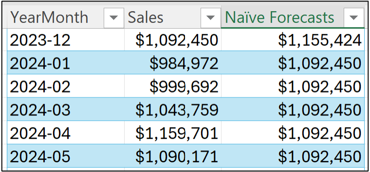
In the case of a naive forecasting model, the forecast for January 2024 is the last known target (i.e., the last target of the training dataset):
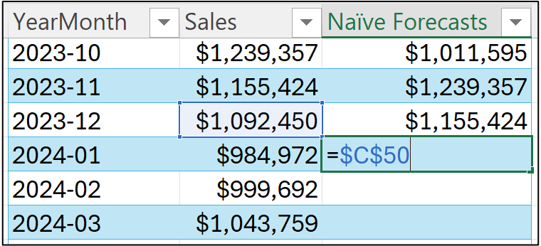
Notice how I'm using an absolute reference (i.e., $C$50) in the image above?
This is because the last known target is located in that cell. So, all of the future (i.e., test dataset) forecasts will be this value.
Hitting <enter> and dragging the formula down the Sales table all the way to December 2024:
Once again, a line chart is helpful to see what's going on. Select all the data in the Sales table and insert a new line chart. I've cleaned up the line chart to make it easier to read:
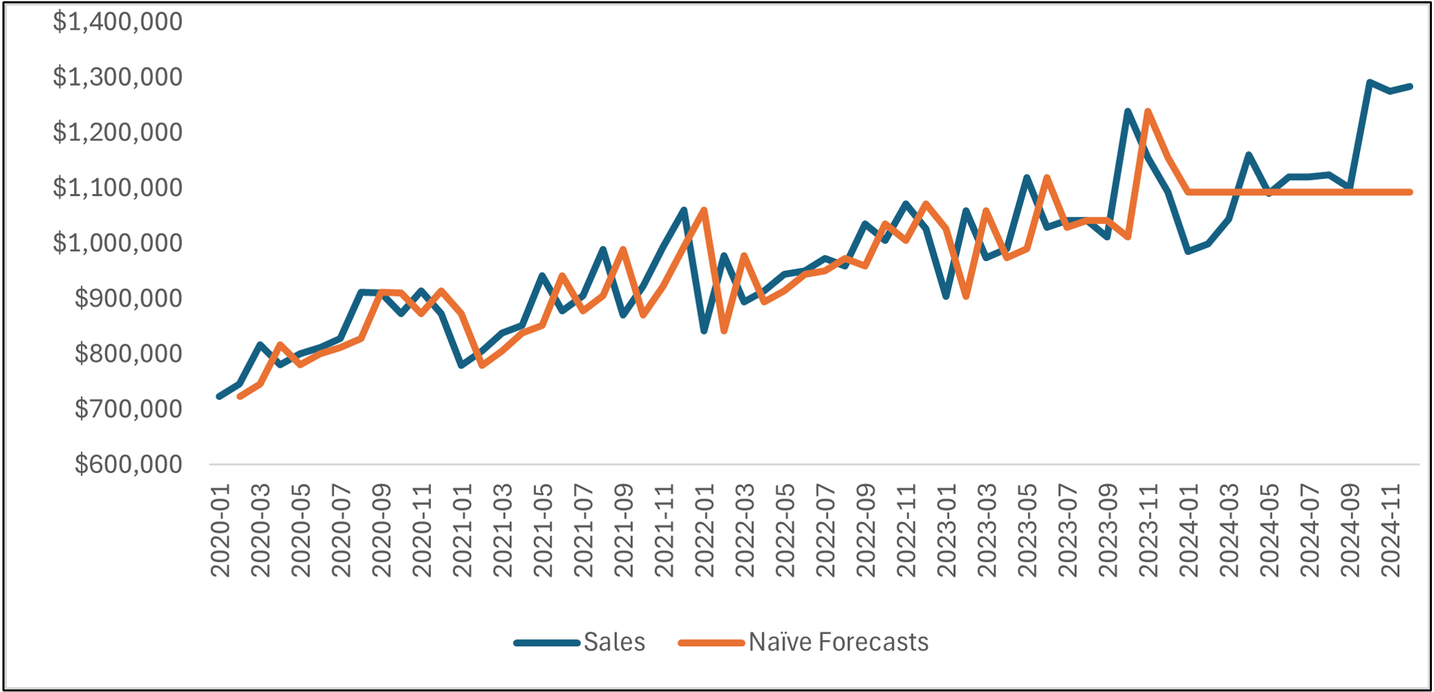
As you can see, the naive forecasting model becomes a flat line starting in January 2024.
The line chart shows that the naive forecasting model hasn't learned any patterns in the data (e.g., trend and seasonality). This lack of complexity in the model obviously produces suboptimal forecasts for the test dataset.
This is the baseline that more complex models (e.g., ARIMA) must beat by learning the historical patterns in the data.
This Week’s Book
ARIMA, like many traditional forecasting techniques, is based on linear regression. Microsoft Excel's Analysis ToolPak makes creating linear regression models relatively straightforward if you know what you're doing. Enter this week's book:
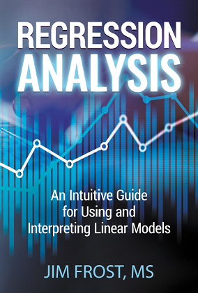
This book is designed for ANY professional to build real-world skills with linear regression. Mr. Frost is an expert at making linear regression approachable using clear language and visuals. I can't recommend this book enough.
That's it for this week.
Next week's newsletter will cover the key performance indicators (KPIs) for understanding the accuracy of your forecasting models.
Stay healthy and happy data sleuthing!

Dave Langer
Whenever you're ready, here are 3 ways I can help you:
1 - The future of Microsoft Excel forecasting is unleashing the power of machine learning using Python in Excel. Do you want to be part of the future? Order my book on Amazon.
2 - Are you new to data analysis? My Visual Analysis with Python online course will teach you the fundamentals you need - fast. No complex math required, and Copilot in Excel AI prompts are included!
3 - Cluster Analysis with Python: Most of the world's data is unlabeled and can't be used for predictive models. This is where my self-paced online course teaches you how to extract insights from your unlabeled data. Copilot in Excel AI prompts are included!