
Join 1,000s of professionals who are building real-world skills for better forecasts with Microsoft Excel.
Issue #64 - Customer Lifetime Value Part 4:
RFM Segmentation
This Week’s Tutorial
Most CLV frameworks stall before they produce anything useful:
They require months of historical data.
They need statistical assumptions you can't easily validate.
They produce a single predicted number per customer that nobody in the business knows how to act on.
RFM doesn't have these problems.
(R)ecency, (F)requency, and (M)onetary scores, when combined, give you a customer segmentation based on behavioral signals you can build in an afternoon and use by the next morning.
However, I want to be crystal clear on this point.
RFM is not a perfect predictor of CLV.
But it's a practical, actionable proxy that beats averages by a wide margin. And it's the foundation on which the predictive CLV model in Part 5 will be built.
What RFM Measures
Each signal captures something distinct about customer behavior.
(R)ecency is how recently a customer made a purchase. A customer who bought last week is a fundamentally different opportunity than one who last bought 18 months ago. Recency is the strongest single predictor of whether a customer will buy again.
(F)requency is how many times a customer has purchased. Higher frequency signals habit and loyalty. Two things that correlate strongly with long-run value.
(M)onetary is how much a customer has spent in total. It's the most direct connection to CLV, but it's also the most misleading when used alone. A customer who made one large purchase looks identical to a loyal repeat buyer at the same spend level.
That's exactly why you need all three together. Each one tells a partial story. Combined, they tell you who your customers actually are.
Step 1: Calculate Raw RFM Values
You'll build on the cleaned dataset from Part 2, so I won't repeat that content here for brevity.
Per my usual, I will be using Python in Excel for this tutorial. However, 99+% of the code is the same whether you use Excel, VS Code, or Jupyter Notebook.
As you learned in Part 2, here are my comments in my dedicated Python Code worksheet:

The code for the first 4 Python formulas is the same as Part 2. Here's the code for cell C6:
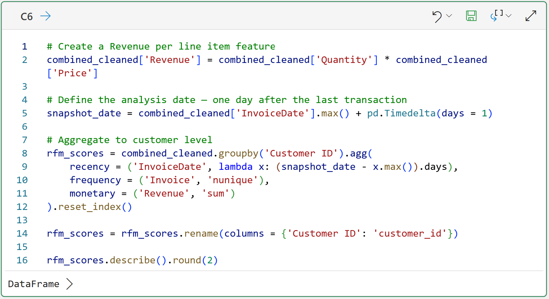
The code in cell C6 handles the following:
Each row in the dataset represents a single product purchase for a single invoice. This is a common real-world way to represent data. Line 2's code calculates the Revenue for each line item in the dataset.
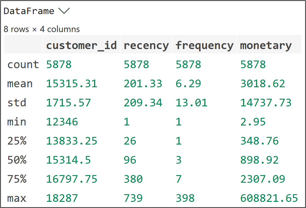
Recency is measured in days since last purchase, counted backward from the snapshot_date. Lower is better. A recency of 5 means they bought 5 days ago, and that's a strong signal. Higher recency means more time has passed since their last purchase.
Frequency uses nunique() on Invoice, same as Part 2. It counts distinct orders (i.e., unique invoice numbers), not the line items.
Monetary is total revenue, not average order value. For RFM scoring purposes, total spend is the right signal because it reflects cumulative value delivered, not just order size.
Step 2: Score Each Dimension
The raw RFM values aren't directly comparable. A recency of 30 days and a frequency of 8 orders live on completely different scales. Scoring puts all the data on equal footing (i.e., scoring normalizes the data).
Here's a common approach to RFM scoring:
Divide customers into five equal groups on each dimension (e.g., Recency).
Assign a score of 1 to 5 based on the ranking of the calculated values.
For Recency, lower days = better, so the scoring is inverted.
For Frequency and Monetary, higher = better.
NOTE - It's also common to score using 1 to 10 if you need more fine-grained segmentation of your data.
Here's the code to calculate each score:
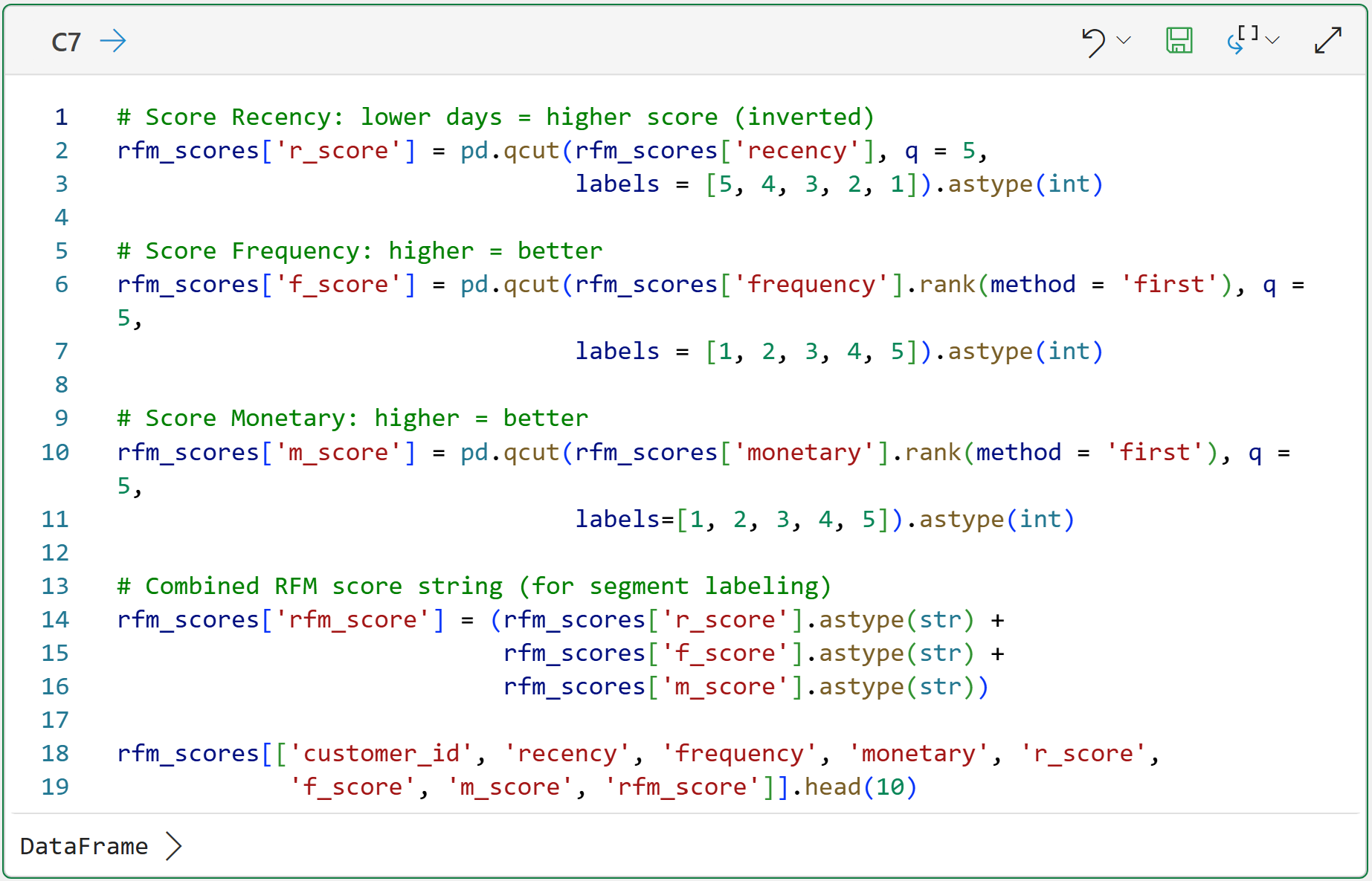
The code in cell C7 uses the qcut() function to divide the values of each feature (e.g., monetary) into 5 groups of scored values (i.e., quintiles):
The top 20% of values receive a score of 5.
The next 20% receive a score of 4.
You get the idea.
BTW - the rank(method = 'first') code for f_score (Frequency) and m_score (Monetary) is there to handle ties before passing to qcut().
Without it, duplicate values at the score boundaries cause errors. It's a common gotcha with many datasets.
Step 3: Assign Customer Segments
Individual RFM scores are useful as inputs to predictive models.
But for business decisions, named segments are more actionable. Business stakeholders resonate with data stories involving "Champions" and "At-Risk" but not with "RFM score 543."
The following utility function assigns a segment name based on the RFM quintile scores. You can think of these segment names as being like personas:
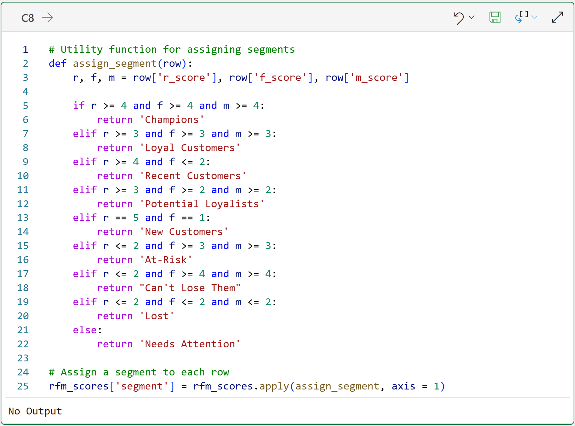
When performing your own RFM customer segmentations, feel free to change the above function code to whatever makes sense for your business.
For example, if you're using scores of 1-10, you will need finer-grained logic and more customer segment names.
Summarizing the segments can be quite useful for seeing the "big picture" of what's going on in the data. The following code builds a DataFrame that will be used to visualize the segments:
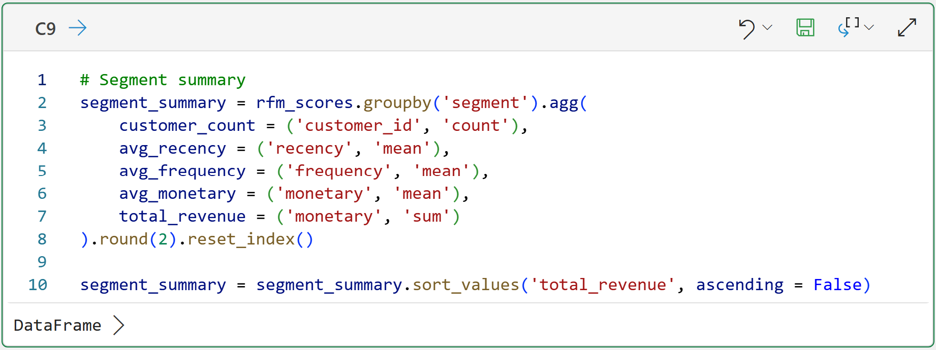
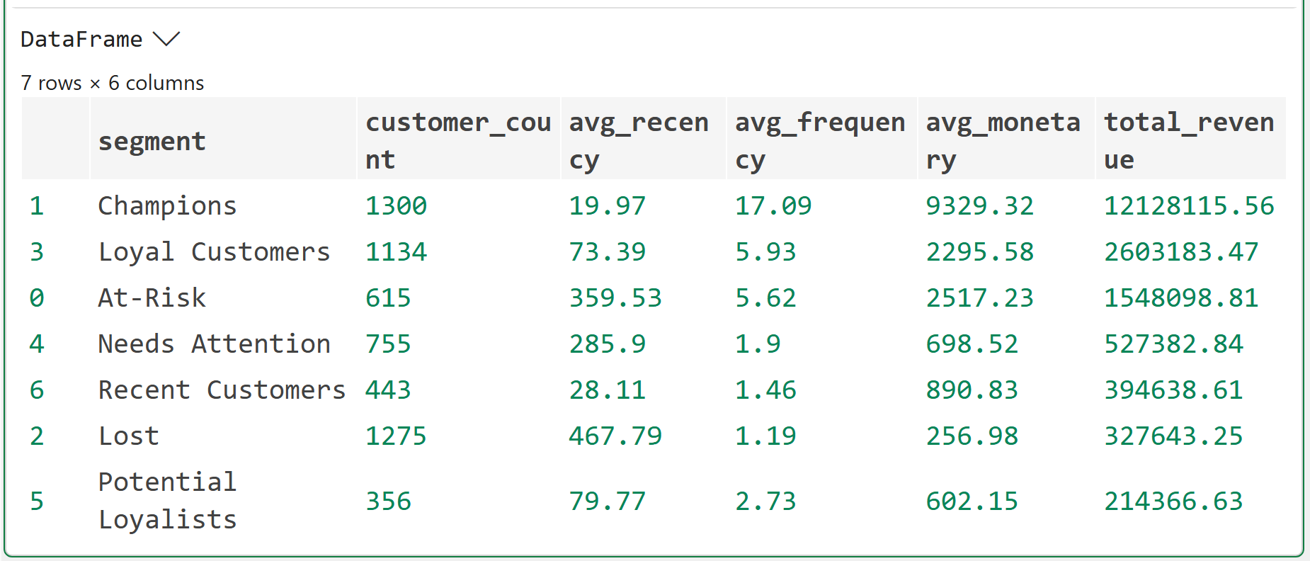
Look at the summary table carefully. You'll notice something immediately.
Champions typically represent 10–15% of customers but a disproportionate share of total revenue, often 40–50%. That's the concentration effect you saw in the Part 2 distribution chart, but now it has names attached.
The Can't Lose Them segment is the one that demands immediate attention in any business. These are customers with high historical frequency and monetary value who haven't purchased recently.
Here's why.
Can't Lose Them were Champions. Something changed. You don't want to find out what by watching them disappear entirely.
Interestingly, this dataset doesn't include any Can't Lose Them.
Step 4: Visualize the Segment Landscape
Two charts. The first shows segment size and revenue contribution. The second is a kind of heatmap so you can see how the scoring logic translates to actual customer positions.
Here's the code for the first chart:

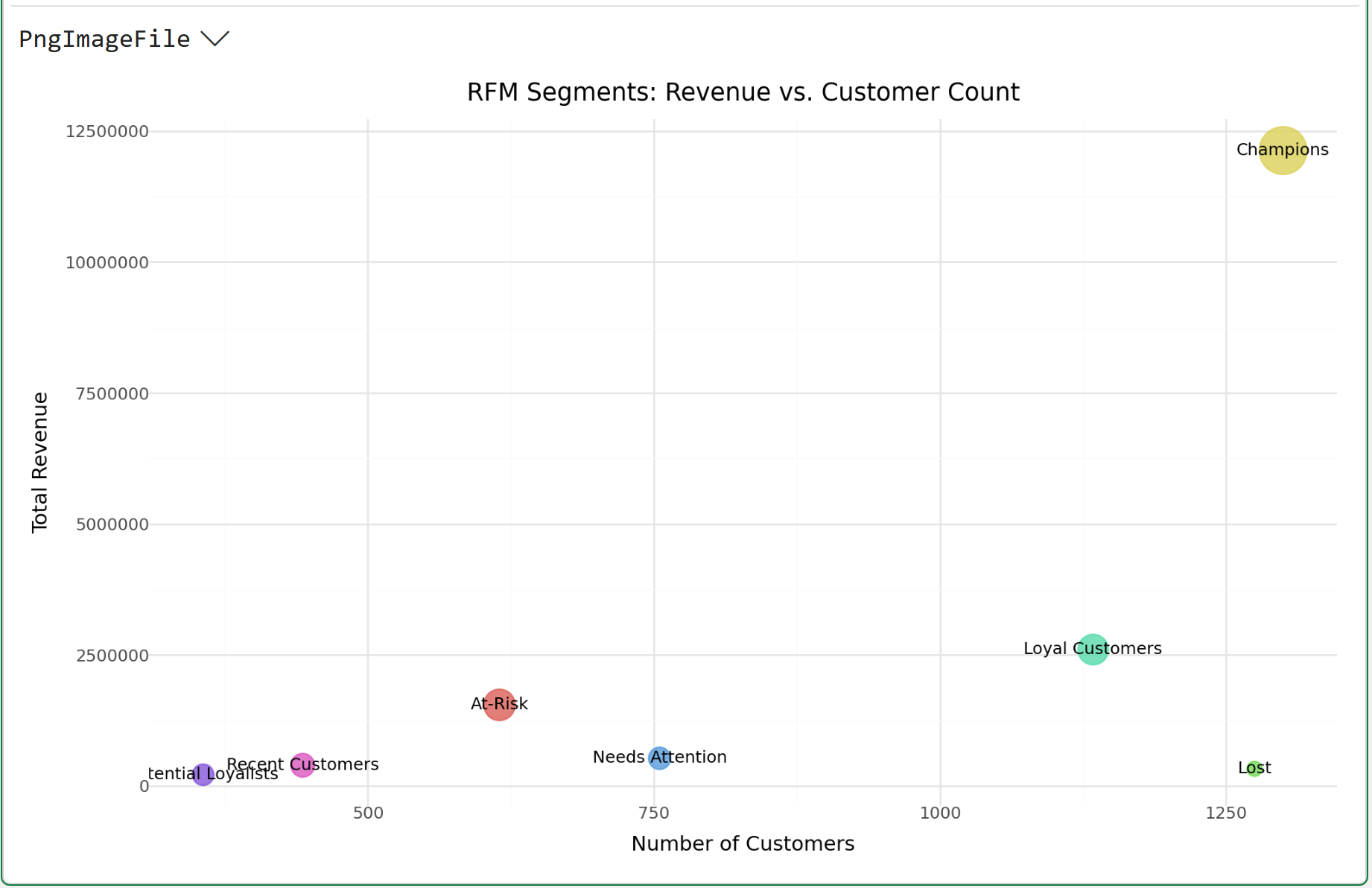
Here's how you read the above visualization, using Champions as the example:
There are 1,300 customers in this segment.
The total revenue of these customers is 12,128,115.
The size of the circle is the average monetary value per customer (i.e., 9,329).
The easiest way to interpret this visualization is that Champions are far and away the best among all segments. So, it's very likely that focusing marketing efforts elsewhere will produce better ROI.
Here's the code for the next visualization:
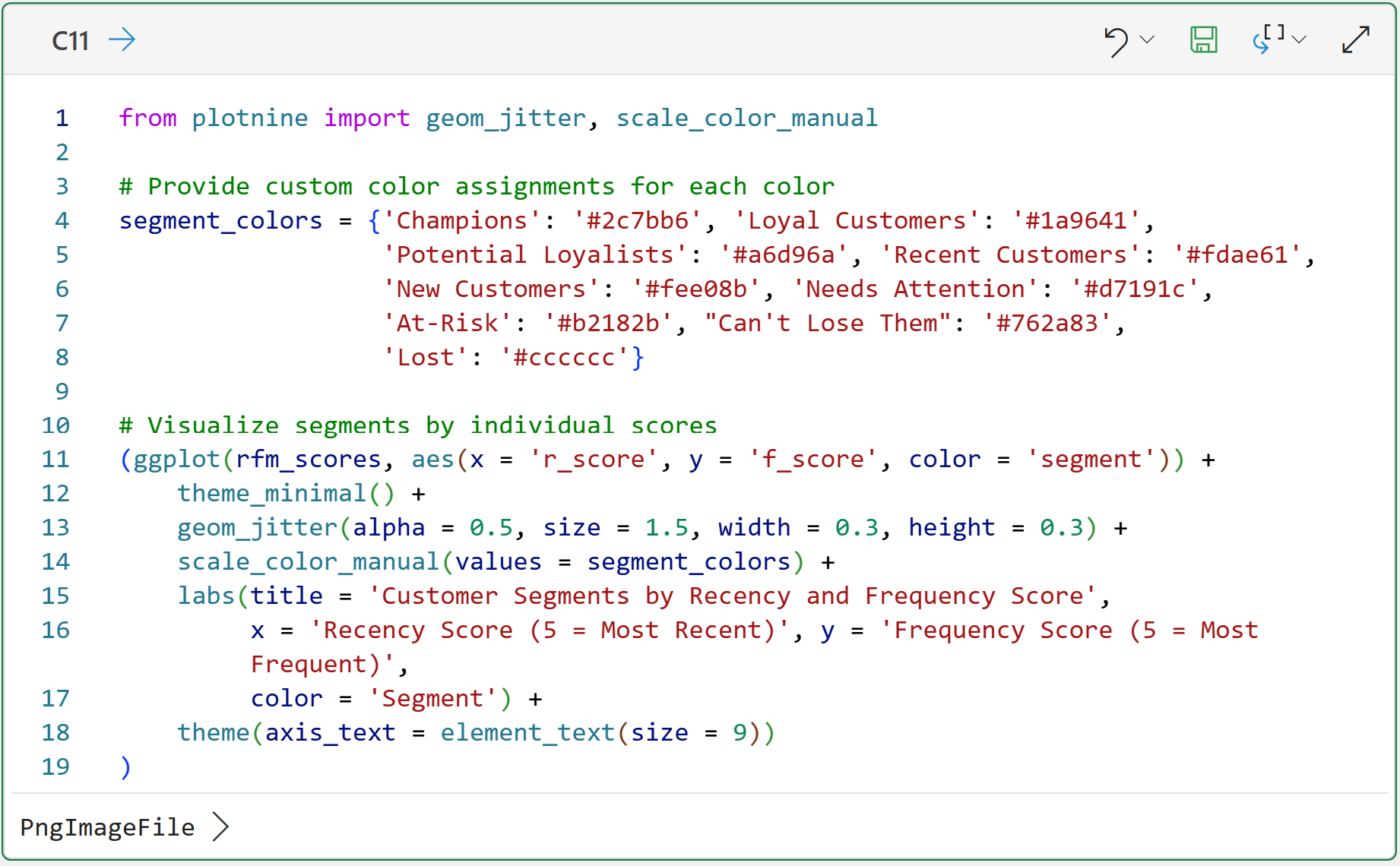
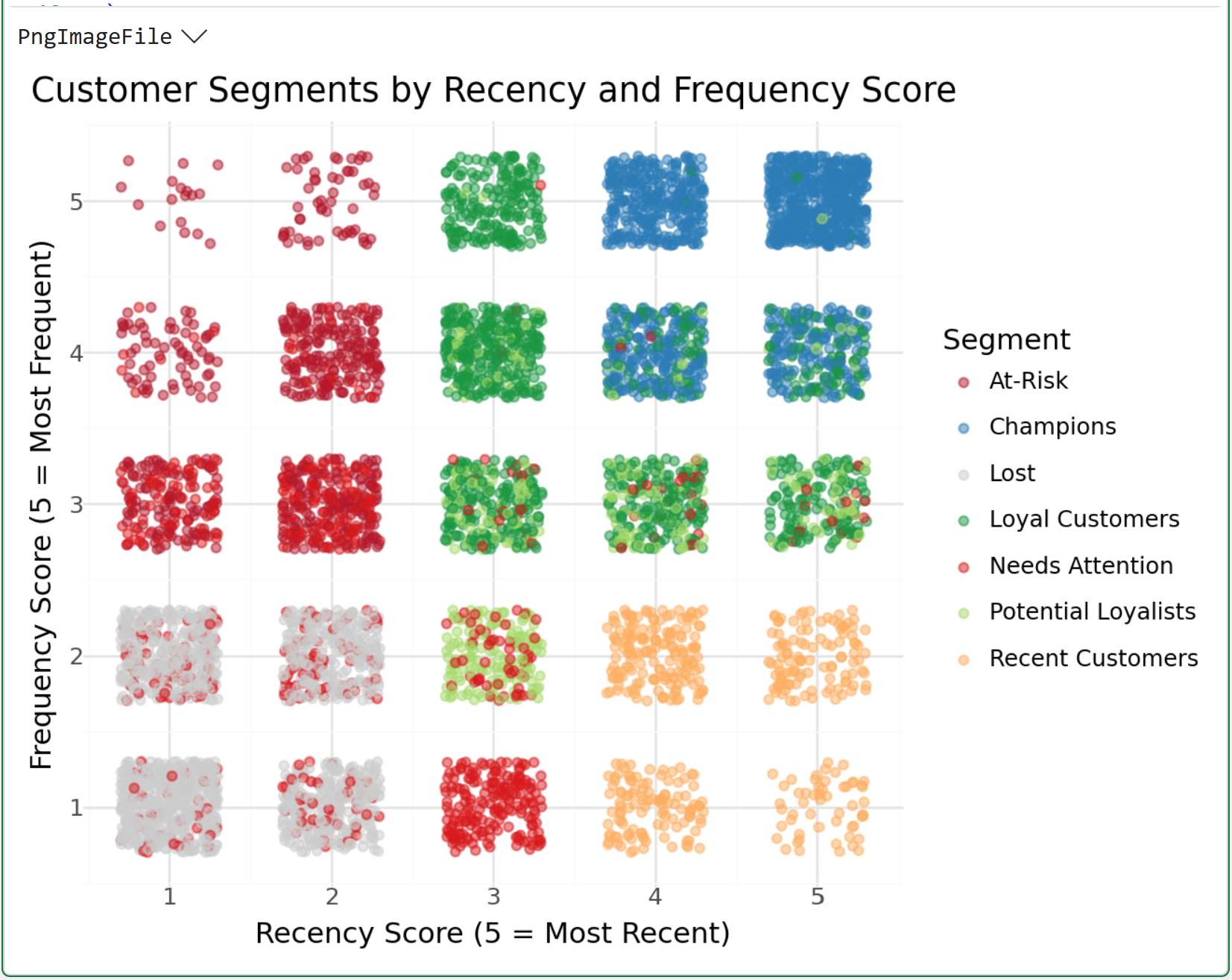
The visualization above is a heatmap illustrating where marketing efforts might have the best ROI.
For example, targeting the top-right corner of the heatmap is likely a low-ROI play due to the high concentration of Champions.
The CLV Connection
Here's why this matters beyond the segmentation itself.
Each RFM segment has a fundamentally different expected CLV trajectory.
Champions are already delivering high value and have strong signals of continued loyalty.
New Customers have unknown trajectories. They could become Champions or Lost, and you don't yet know which.
At-Risk customers have demonstrated historical value but declining engagement, which means their forward-looking CLV is deteriorating in real time.
That distinction between historical value and expected future value is the core of CLV thinking. RFM segments let you see it without first building a full predictive model.
For now, your segment table is the actionable output. Use it to answer three questions:
Which customers deserve retention investment right now? (At-Risk, Can't Lose Them)
Which customers are worth accelerating? (Potential Loyalists, Recent Customers)
Which customers are already optimized, meaning you shouldn't overspend on them (e.g., Champions buying on their own schedule don't need more promotions)?
BTW - that last point is one I've seen organizations get wrong consistently. High-value customers get the most marketing attention because they're the most valuable.
But Champions often respond to over-communication by churning.
Their behavior is already self-sustaining. Leave them alone and focus your retention budget on the segments that are actually slipping.
The Bottom Line
RFM segmentation is the practical bridge between raw transaction data and business decisions. It doesn't require a machine learning model, months of history, or statistical assumptions you can't explain to a stakeholder.
Recency is the strongest single signal. Frequency confirms habit. Monetary value reflects cumulative worth.
Together, they produce named segments with distinct CLV trajectories. And a clear map of where your retention and acquisition energy should go.
Champions are not where you spend. At-Risk and Can't Lose Them are.
That's it for this week.
My next newsletter will continue this tutorial series by teaching you about predictive CLV using machine learning.
Stay healthy and happy data sleuthing!

Dave Langer
Whenever you're ready, here are 3 ways I can help you:
1 - The future of Microsoft Excel is unleashing the power of do-it-yourself (DIY) analytics using Python in Excel. Do you want to be part of the future? My Python in Excel Accelerator online course will teach you what you need to know, and the Virtual Dave AI tutor is included!
2 - Are you new to data analysis? My Visual Analysis with Python online course will teach you the fundamentals you need - fast. No complex math required, and the Virtual Dave AI Tutor is included!
3 - Cluster Analysis with Python: Most of the world's data is unlabeled and can't be used for predictive models. This is where my self-paced online course teaches you how to extract insights from your unlabeled data. The Virtual Dave AI Tutor is included!