
Join 1,000s of professionals who are building real-world skills for better forecasts with Microsoft Excel.
Issue #62 - Customer Lifetime Value Part 2:
The Simple Formula (And Why It Lies to You)
This Week’s Tutorial
If you're new to this tutorial series, check out Part 1 here.
There's a version of the customer lifetime value (CLV) calculation based on historical data that fits on a napkin:
CLV = Average Order Value × Average Purchase Frequency × Average Lifetime
Three numbers. One multiplication. Done.
And here's the uncomfortable truth.
When using historical data for all your customers, this formula is reasonable, but it is also completely misleading.
In this tutorial, you're going to build this CLV calculation. You're going to get the CLV number. And then you're going to watch it fall apart - which is the whole point.
Loading the Data
In this tutorial series, I will be using the UCI Retail Online II dataset. Specifically, I will be using a version of the dataset from the Kaggle website.
To make things easy, you can get the OnlineRetail2.xlsx workbook from the newsletter's GitHub repository.
NOTE - While I will be using Python in Excel for this tutorial series, 99+% of the code is the same whether you use Excel, Jupyter Notebook, or VS Code.
In the OnlineRetail2.xlsx workbook, the complete dataset is split across two tables because Excel limits each worksheet to 1,048,576 rows.
To be clear, this limitation does not apply to Python in Excel - it can easily handle more than 1 million rows of data.
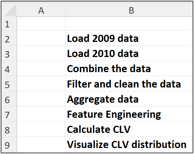
When using Python in Excel, I highly recommend creating a dedicated worksheet (e.g., named Python Code) to store your Python formulas. I also highly recommend organizing your Python formulas step by step in a vertical orientation.
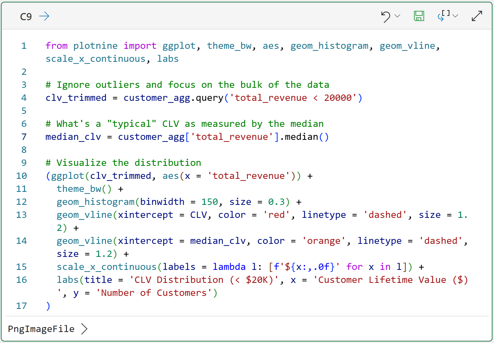
Here's how I organized the Python in Excel code for this tutorial on a dedicated worksheet, step by step, with comments:
I then place the Python formulas in column C, aligned with each step. The easiest way to write your Python in Excel code is to use Excel's new Python Editor:

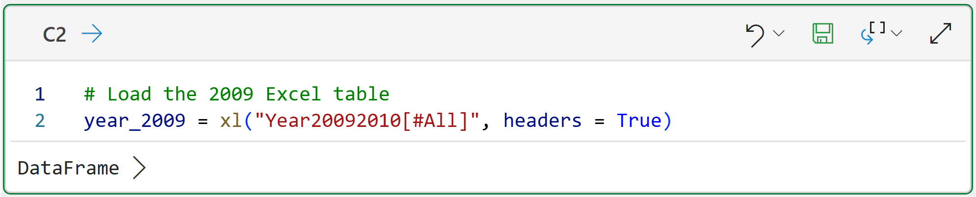
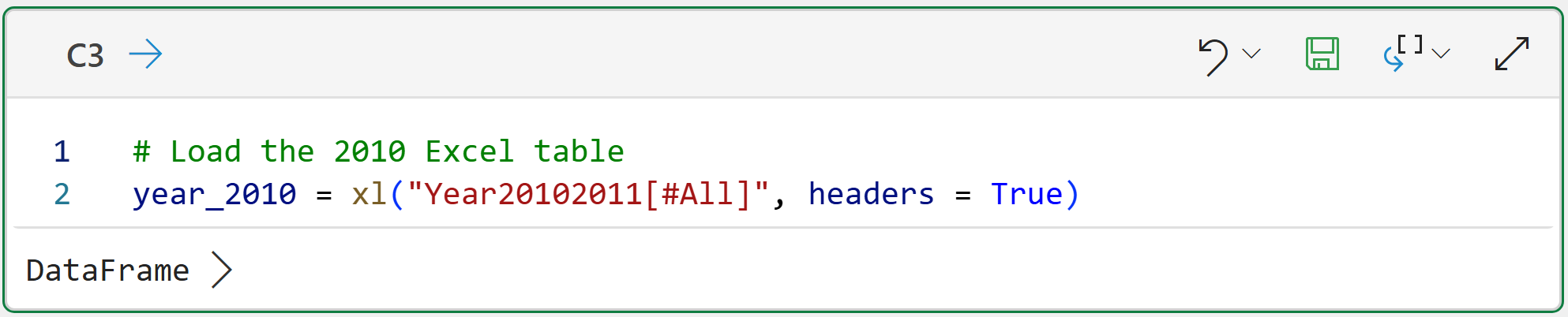
Clicking the Add Python cell... button will create a new kind of cell that accepts Python formulas. You use these cells to hold your Python code. Here's the code for cell C2:
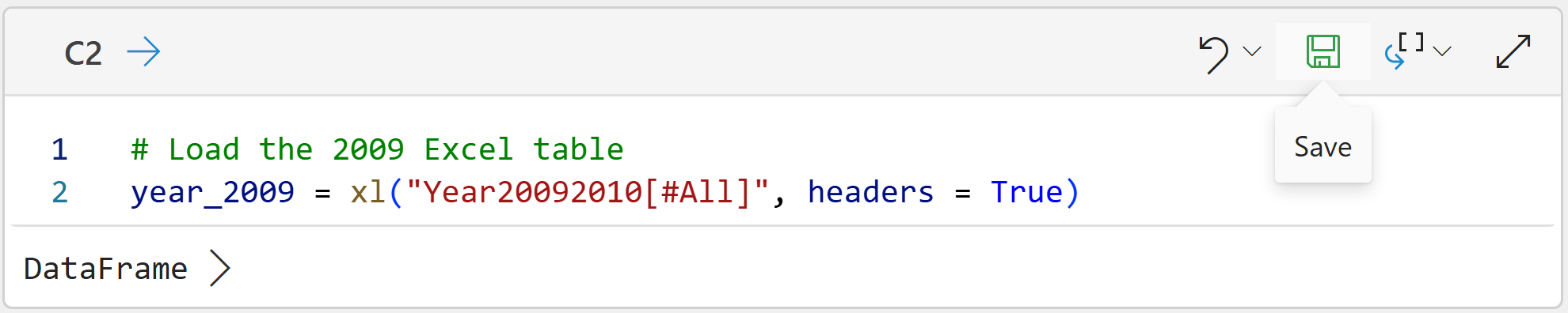
To run the code, click the icon in the cell that looks like a floppy disk (i.e., Save):
And the code for cell C3:
The code in cells C2 and C3 is the only Excel-specific code in this tutorial. All the following Python code is the same regardless of what technology you use (e.g., Jupyter Notebook).
BTW - If you're new to Python in Excel, my Python in Excel Accelerator online course will teach you the foundation you need for analytics fast.
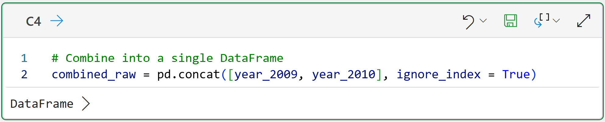
The following Python code takes the individual tables (i.e., DataFrames) and combines them into a single dataset in cell C4:
You can get a preview of the combined DataFrame by hovering your mouse over the [PY] in the worksheet and clicking to see the card:
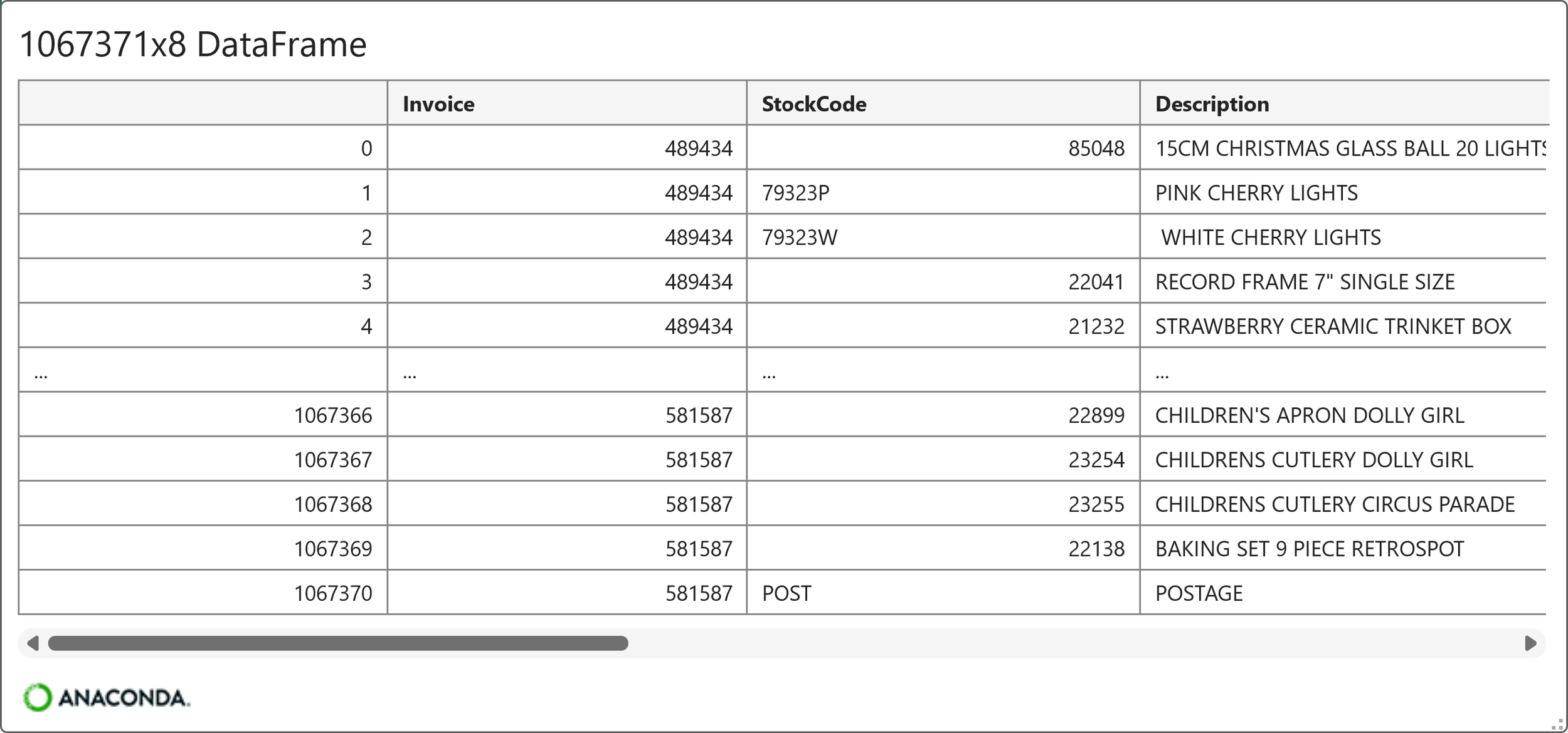
As shown in the card above, the DataFrame contains 1,067,371 rows and 8 columns. Each row of the DataFrame represents a product purchase made by an online retail customer. Here's the list of columns (i.e., features) in the dataset:
Invoice
StockCode
Description
Quantity
InvoiceDate
Price
Customer ID
Country
As you can see in the card above, the invoice numbers are repeated to accommodate multiple products purchased in a single order. This is a common real-world way to structure customer order data.
Because of this structure, the data must be aggregated to the customer level to perform the CLV calculation.
However, before that can happen, the data needs to be cleaned.
Cleaning the Data
While not terrible, the dataset does demonstrate common ways the data you analyze to calculate CLV can be dirty:
Some rows are missing Customer ID values.
Some rows actually represent canceled orders, denoted by an Invoice value starting with C.
Some rows have Quantity and/or Price values that are not positive numbers (e.g., a negative value could represent a returned product).
The following code cleans the data by removing rows that have the above issues:
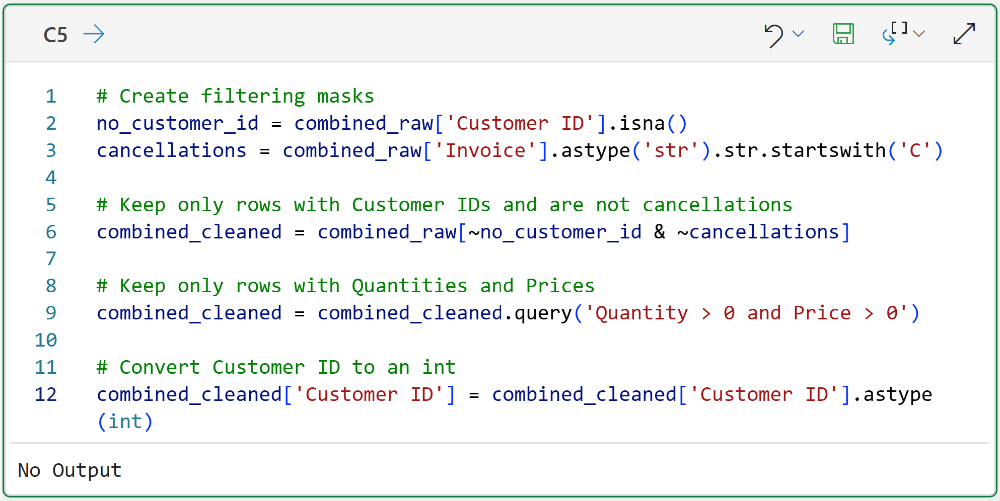
In the code above, line 12 ensures that the Customer ID is a whole number (i.e., an integer) for later data aggregation.
Calculating CLV
With the data loaded, combined, and cleaned, it's time to calculate CLV. As you know, the dataset needs to be aggregated to the Customer ID level to make this possible:
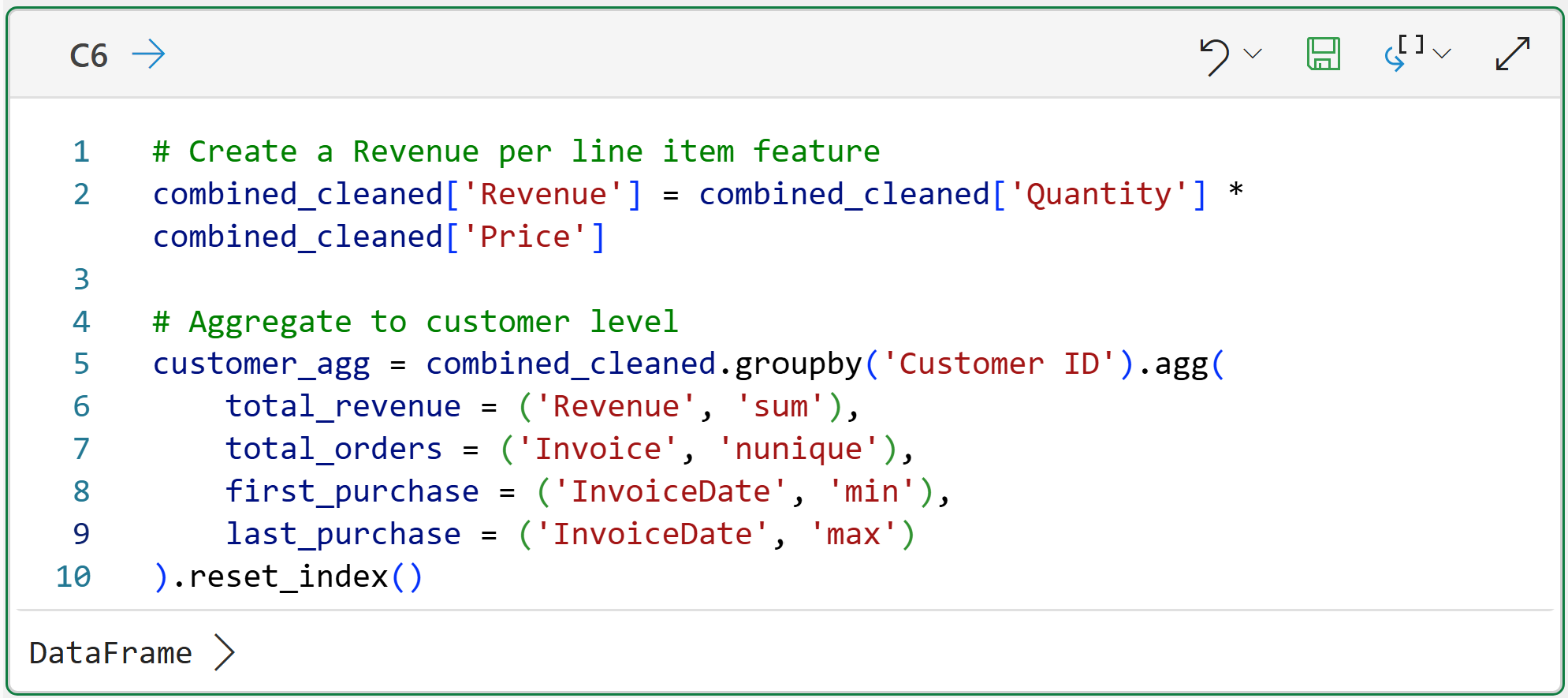
In the code above, line 2 creates a new feature that represents the revenue for each product purchased per row in the dataset.
Line 5 is where the magic happens. You can think of this code as being like an Excel PivotTable or a GROUP BY in SQL. The code is aggregating the data by each unique Customer ID and creating per-customer calculations:
The total customer revenue across all invoices and products (i.e., StockCode).
The total number of orders (i.e., the total unique values of Invoice per customer).
When a customer made their first and last purchase.
Here's the card for the aggregated DataFrame:
As the card above shows, while the original dataset has more than 1 million rows, the cleaned dataset has only 5,878 customers.
The above aggregated data is the starting point for building the features needed for the simple historical CLV calculation defined at the beginning of this tutorial.
The next important step is calculating each customer's lifetime. As it turns out, this is often a hard problem because you don't always know when a customer's relationship ends.
For example, in a subscription-based business, calculating customer lifetime is much simpler because customers explicitly cancel their subscriptions (i.e., the relationship), providing a signal.
However, in domains like e-commerce, you never know for sure when a customer's lifetime is actually over because there's no explicit signal. So, a common strategy is to take the difference between a customer's first and last order:
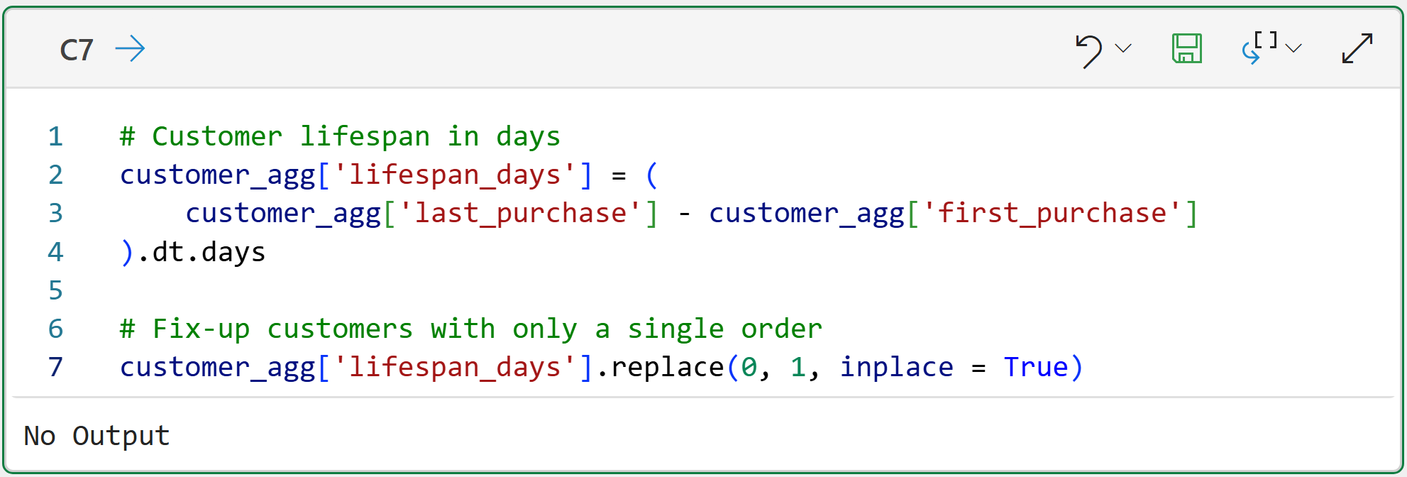
While calculating customer lifetime in this way is intuitive, it does have several issues. For example, customers who have only placed a single order will have a calculated lifetime of 0 days.
The code on line 7 of cell C7 demonstrates a simple, but imperfect, fix for this situation - assume all customers with a single order have a lifetime of 1 day.
With the lifespan_days feature engineered, it's time to run the simple historical CLV calculation for all customers:
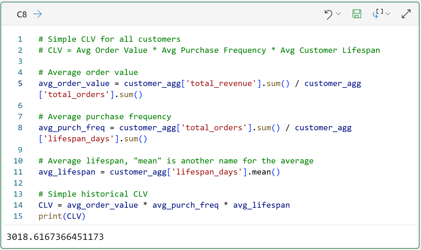
Take a step back and think about what the above CLV value of $3,018.62 represents. This CLV value aims to predict a customer's typical gross revenue.
This prediction is one of the most powerful metrics available to businesses because it drives so many decisions:
What marketing channels make sense (e.g., when CLV is low, marketing campaigns must be very effective and/or cheap)?
What level of customer service makes the most sense (e.g., high CLV allows for higher levels of service)?
What interventions are possible to keep customers (e.g., when CLV is high, offering discounts to keep customers)?
Now, here's the problem with the CLV calculation above.
In the real world, it often inflates customer value, leading to poor business decisions.
Visualizing CLV
The easiest way to understand how this simple historical CLV calculation distorts reality is to visualize all the individual customer CLVs and then see how they relate to the calculated value of $3,018.62.
Technically, what is being compared is the simple historical CLV value to the distribution of individual customer CLV values. In this tutorial, I will define each customer's CLV as their total revenue (i.e., the to-date customer CLV).
The single best visualization for analyzing a distribution of numbers is a histogram:
The code above uses my favorite Python data visualization library for analytics - the mighty plotnine.
Before I get into the visualization, some things to note about the code in cell C9:
Line 4 takes a subset of all the data because there are a few customers with very large CLVs (i.e., they are outliers). Removing these from the visualization makes it easier to read, but the outliers are included in the calculations.
Line 7 uses the median as another representation of the typical customer CLV. I will use the median as a comparison.
Line 13 draws a red dashed line on the histogram corresponding to the calculated CLV of $3,018.62.
Line 14 draws an orange dashed line on the histogram corresponding to the median of the individual to-date customer CLVs (i.e., the value of $898.92).
Line 15 makes sure that the labels along the x-axis have dollar signs.
Clicking PngImageFile > at the bottom of cell C9 displays the histogram:
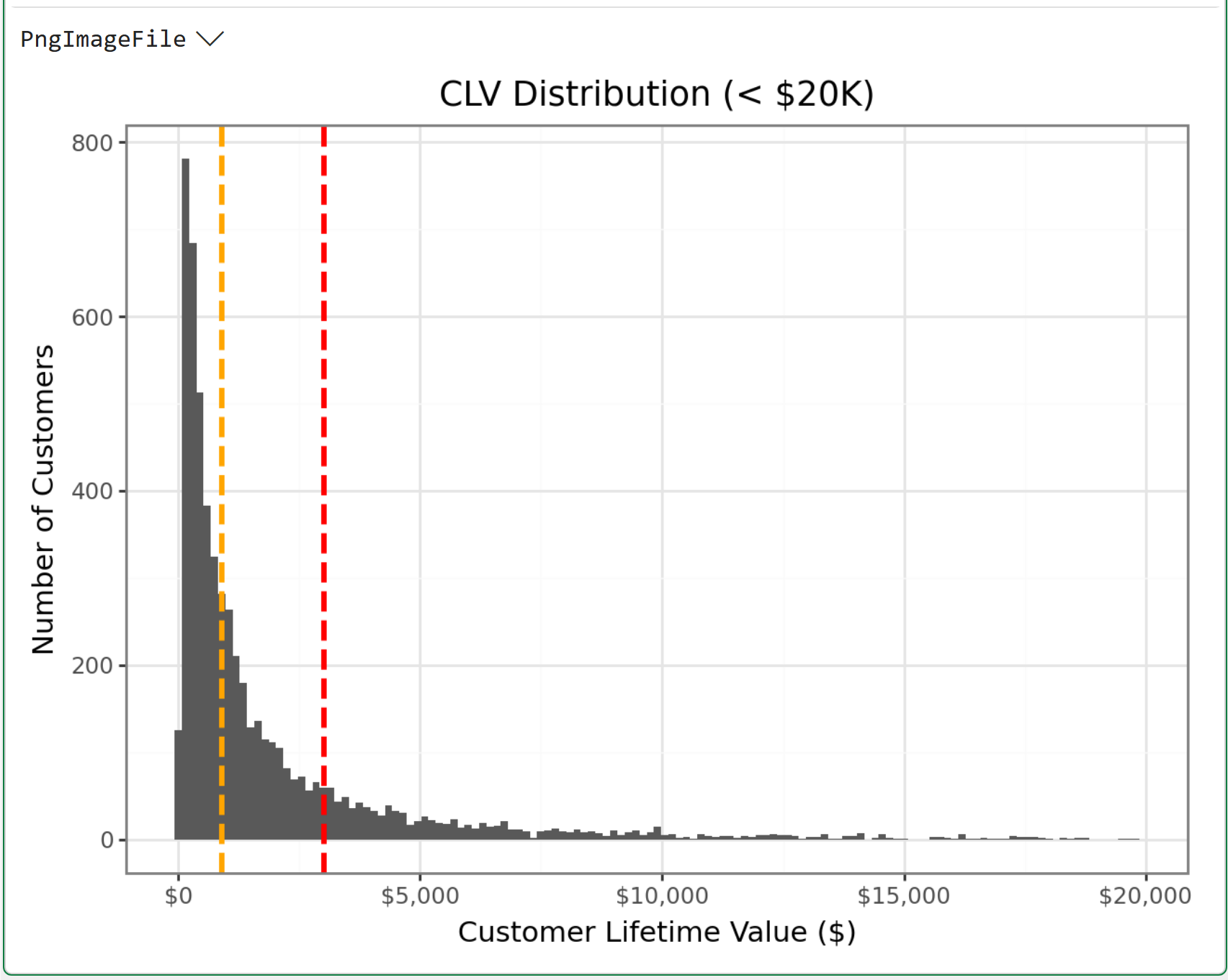
If you're unfamiliar with histograms, or it's been a really long time since you took a statistics course, here's an easy way to think about the visualization above:
Where is all the black ink located?
For example, notice how there's way more black ink to the left of the red dashed line? That's telling you that the calculated CLV of $3,018.62 is not representative of a typical to-date customer CLV.
Now, look at the dashed orange line. See how the total amount of black ink is more balanced on both the left and right sides of the orange line? That shows that the $898.92 value represents a typical to-date customer CLV much better.
The simple historical CLV calculation appears to be off by more than $2,000!
Now, let me ask you this.
If an organization blindly used the calculated CLV of $3,018.62, how likely is it that they are making good decisions?
That's it for this week.
My next newsletter will continue this new tutorial series by building the simple CLV formula.
Stay healthy and happy data sleuthing!

Dave Langer
Whenever you're ready, here are 3 ways I can help you:
1 - The future of Microsoft Excel is unleashing the power of do-it-yourself (DIY) analytics using Python in Excel. Do you want to be part of the future? My Python in Excel Accelerator online course will teach you what you need to know, and the Virtual Dave AI tutor is included!
2 - Are you new to data analysis? My Visual Analysis with Python online course will teach you the fundamentals you need - fast. No complex math required, and the Virtual Dave AI Tutor is included!
3 - Cluster Analysis with Python: Most of the world's data is unlabeled and can't be used for predictive models. This is where my self-paced online course teaches you how to extract insights from your unlabeled data. The Virtual Dave AI Tutor is included!