

Join 1,000s of professionals who are building real-world skills for better forecasts with Microsoft Excel.
Issue #63 - Customer Lifetime Value Part 3:
Cohort Analysis
This Week’s Tutorial
Retention rate is one of the most cited metrics in business. It's also one of the most misleading.
When someone says "our retention rate is 60%," they usually mean that 60% of customers came back. That number hides more than it reveals.
Because a customer who joined two years ago and a customer who joined last month are not comparable. Their behavior, their loyalty signals, and their future value all belong to completely different contexts.
Cohort analysis fixes this. And it's the piece that has to come before anything predictive in a customer lifetime value (CLV) model.
What Cohort Analysis Actually Is
A cohort is a group of customers who share common characteristics. While these characteristics can be anything, the most commonly used CLV characteristic is time-based.
Specifically, the month and year a customer made their first purchase.
Instead of measuring all customers together, you track each cohort separately. You ask questions like, of the customers who first bought in January 2010, what percentage came back in month 2? Month 3? Month 6? Month 12?
That question, when asked consistently across every cohort, reveals something the aggregate retention number can't:
How customer behavior changes over time.
Whether newer cohorts are better or worse than older cohorts.
BTW - This is also what makes cohort analysis the foundation of CLV modeling. Before you can predict what a customer is worth going forward, you need to understand how customers in their situation have behaved historically. Cohorts give you that lens.
Assigning Customers to Cohorts
If you want to follow along with this tutorial (highly recommended), you'll need to complete Part 2 if you're new to this tutorial series.
Per my usual, I will be using Python in Excel for this tutorial. However, 99+% of the code is the same whether you use Excel, VS Code, or Jupyter Notebook.
As you learned in Part 2, here are my comments in my dedicated Python Code worksheet:

The first 3 steps of this tutorial (i.e., the code in cells C2, C3, & C4) are the same as Part 2, so I won't repeat them here for brevity.
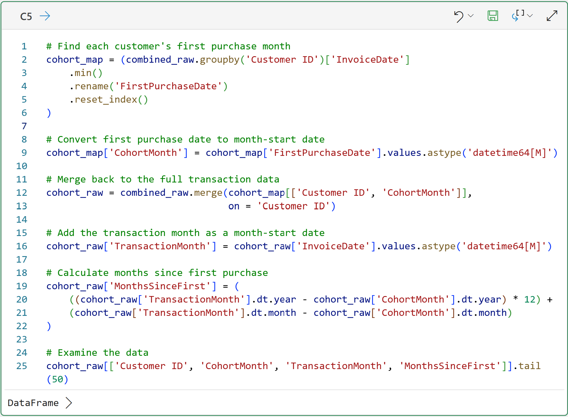
With the data loaded and combined, the first step in the cohort analysis is to enrich the dataset with the following columns (i.e., features) by assigning each row a:
CohortMonth based on the customer's first purchase.
TransactionMonth based on the month of the current purchase.
MonthsSinceFirst, which is the number of months elapsed between the CohortMonth and the TransactionMonth.
The following code creates these features:
As covered in Part 2, you can look at the card in the Python Code workhseet for the DataFrame output for cell C5 to get a preview of the data:
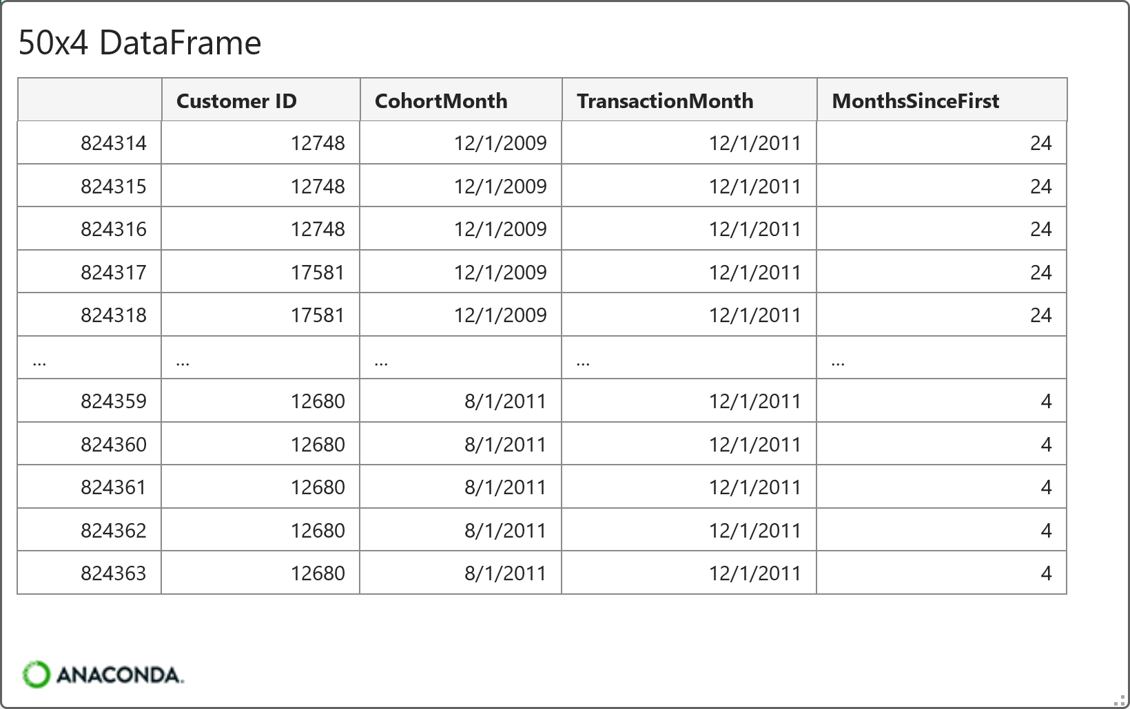
As shown in the card above, this is a common representation for using date-based cohorts in many industries (e.g., e-commerce).
With the raw data created, the next step is to aggregate it and calculate retention rates.
Calculate Cohort Retention Rates
One of the most powerful ways businesses drive revenue is through repeat business from customers. When a customer stops purchasing from a business (e.g., never buying from the website again or canceling a subscription), this is known as churn.
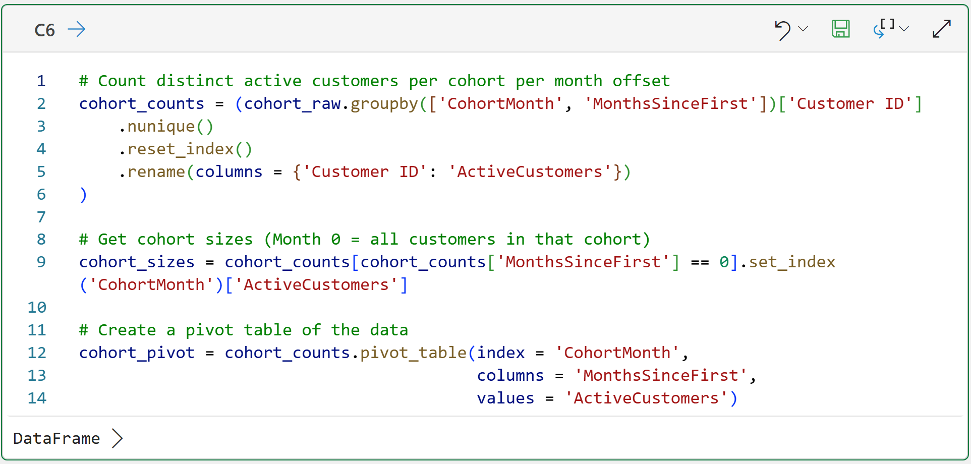
Not surprisingly, the opposite of churn is retention. So, a very useful metric for understanding CLV is cohort retention rates. The first step in calculating these rates is aggregating the raw cohort data:
And here's the card for the DataFrame produced by the code in cell C6:
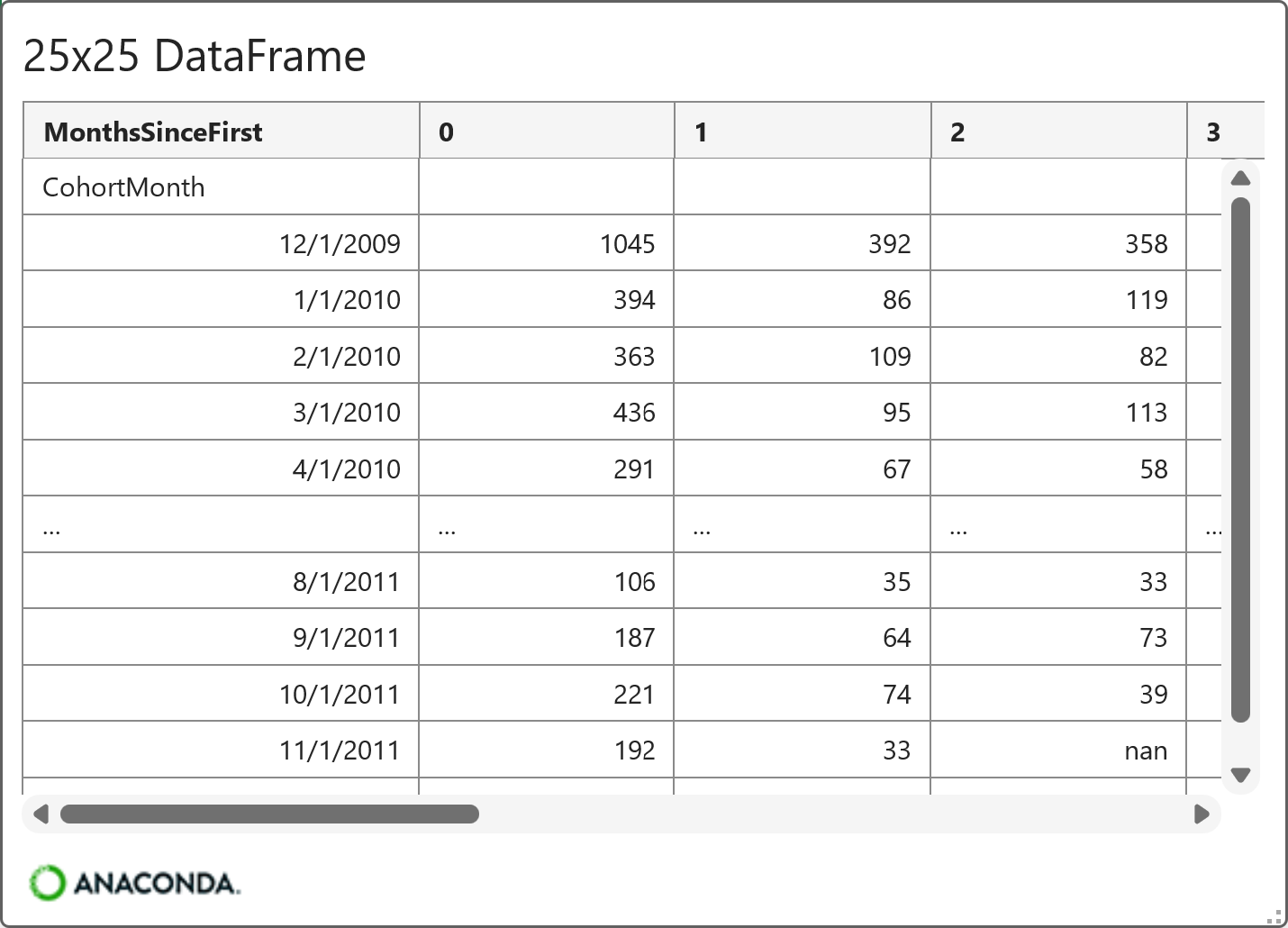
The above card illustrates that the aggregated DataFrame contains each cohort (i.e., the unique values of CohortMonth) and the number of customers for each subsequent month for that cohort (i.e., the values of MonthsSinceFirst).
And here's the code and the card for the calculated cohort retention rates:

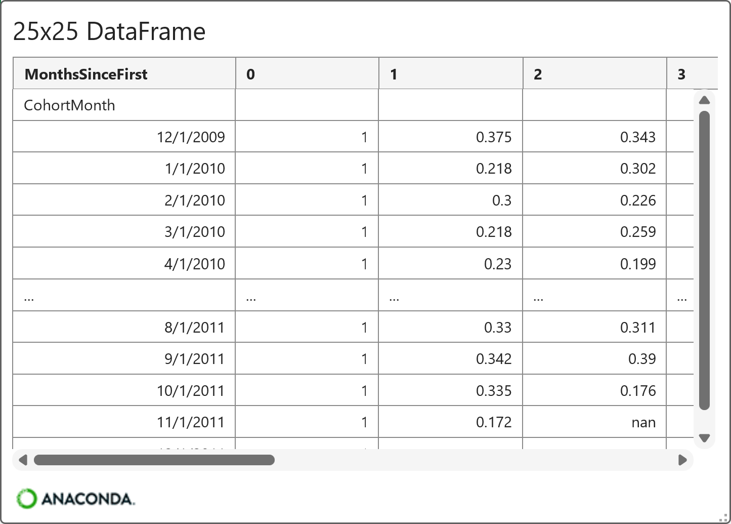
In the DataFrame above, each row corresponds to a CohortMonth, and each column corresponds to a month offset (0, 1, 2, …). The values are retention rates, or the percentage of that cohort of customers who are still active at each point.
For example, you'll notice that MonthsSinceFirst 0 is always 1 (100%). Every customer purchases in their first month, by definition. As another example, 0.375 (37.5%) of customers for the 12/1/2009 cohort are active for MonthsSinceFirst = 1.
The two DataFrames created in this section of the tutorial enable powerful analysis of retention by cohort over time. Here's the first example - creating a cohort retention heatmap.
Visualizing Retention with a Heatmap
While data tables can be useful for analysis, visualizations are far more powerful because humans are visual pattern-recognition machines. For example, a heatmap of the retention rates by cohort over time.
The following code creates a DataFrame optimized for visualizing cohort retention over time as a heatmap:
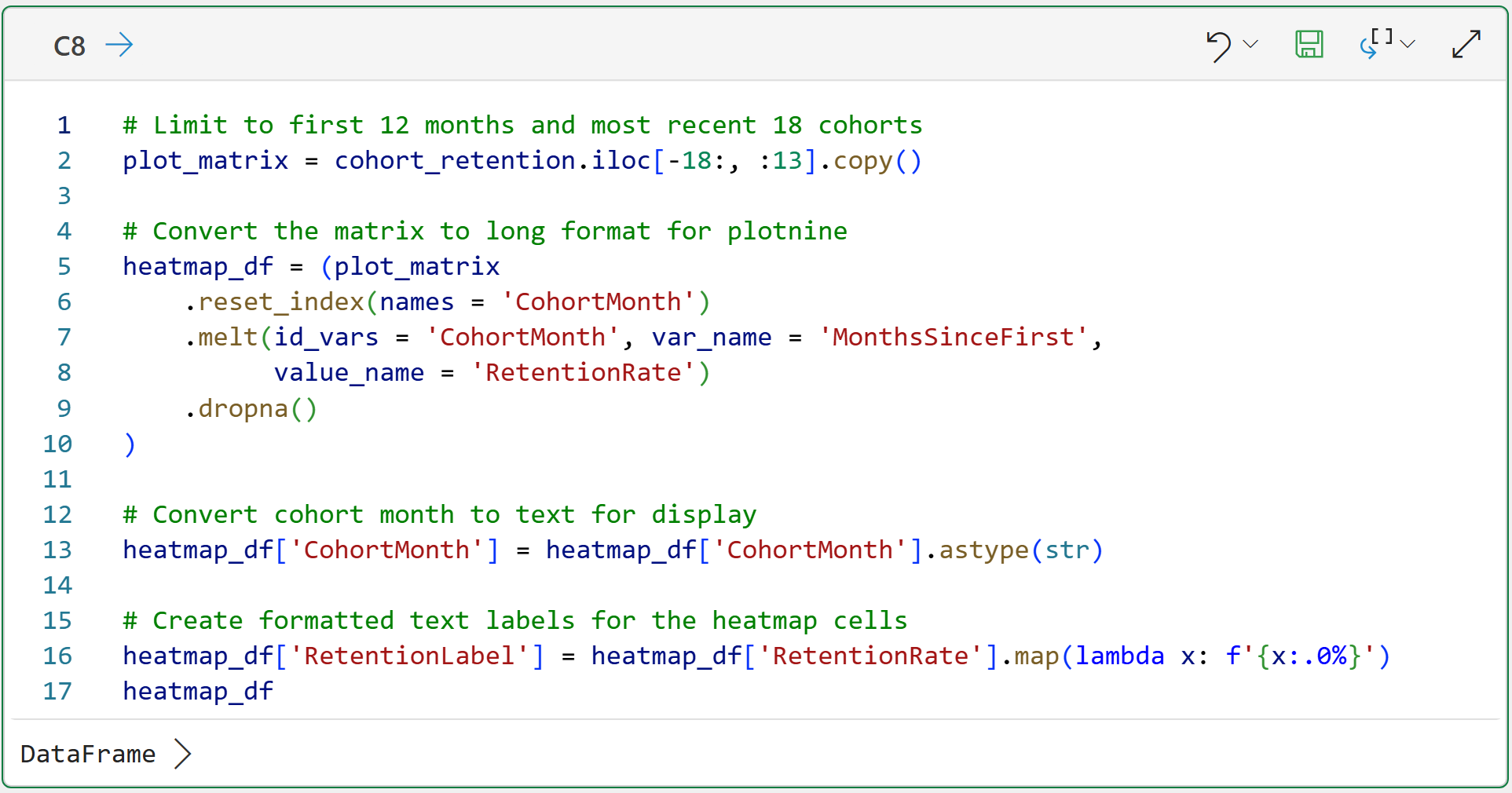
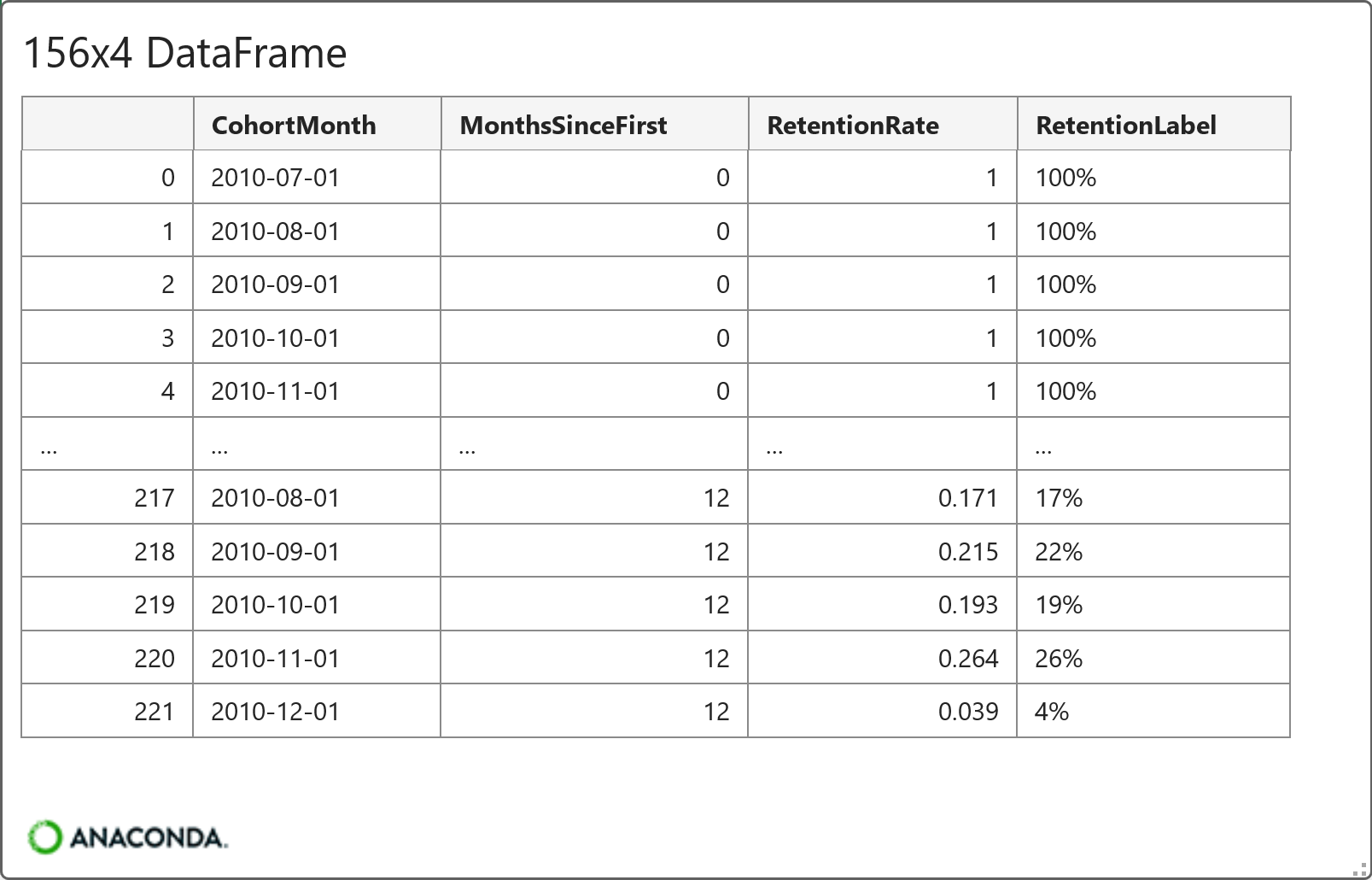
To keep the heatmap from being too large, the code in cell C8 limits the data to the first 12 months of history for the last 18 cohorts (i.e., the 18 newest cohorts by CohortMonth).
This is a bit abstract, so seeing the heatmap makes things much clearer. Here's the code for creating the heatmap using my favorite Python data visualization library - the mighty plotnine:
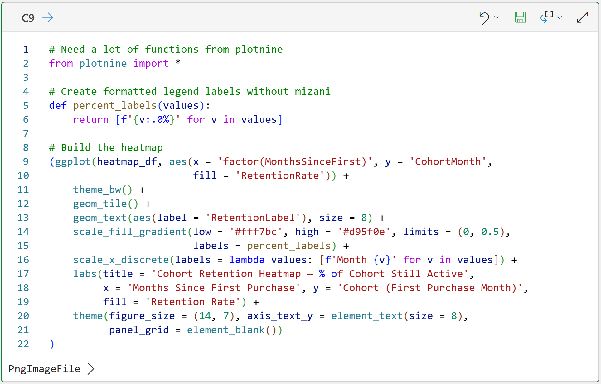
Clicking the PngImageFile > in the Python Editor displays the heatmap:
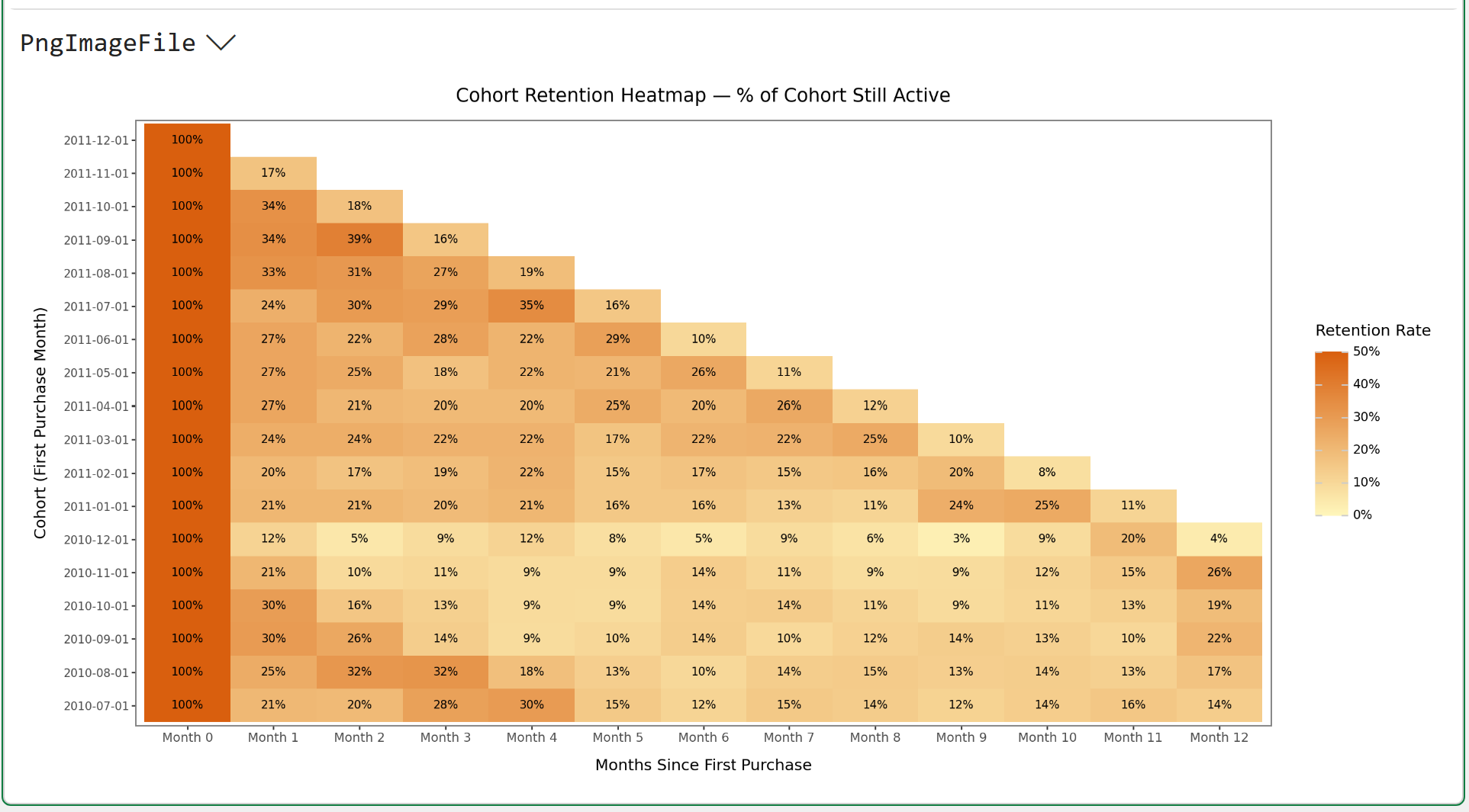
Read the heatmap left to right across any row. That’s the retention curve for a single cohort (i.e., how quickly the cohort retention rate decays).
Read it top to bottom, down any column. That’s the same time offset across different cohorts. It's a way to see whether newer customers are more or less loyal than older ones.
When using the heatmap, you’re looking for two things:
How steeply does retention drop in Month 1 and Month 2? That’s your early churn signal (i.e., the customers who tried you once and left).
Where does the curve flatten? Most businesses have a cohort of high-loyalty customers who stay active for 6, 12, or even 24 months. The heatmap shows the percentage of each cohort that reaches that stable floor.
As powerful as a heatmap is for analyzing CLV, I've found another visual even more powerful.
Cohort Retention Curves
Whenever you're analyzing a metric (e.g., retention rate) over time, your default should be to create a line chart. Make no mistake: variations of line charts are among the most powerful visualizations in real-world analytics.
For example, the best executive dashboards make heavy use of line charts.
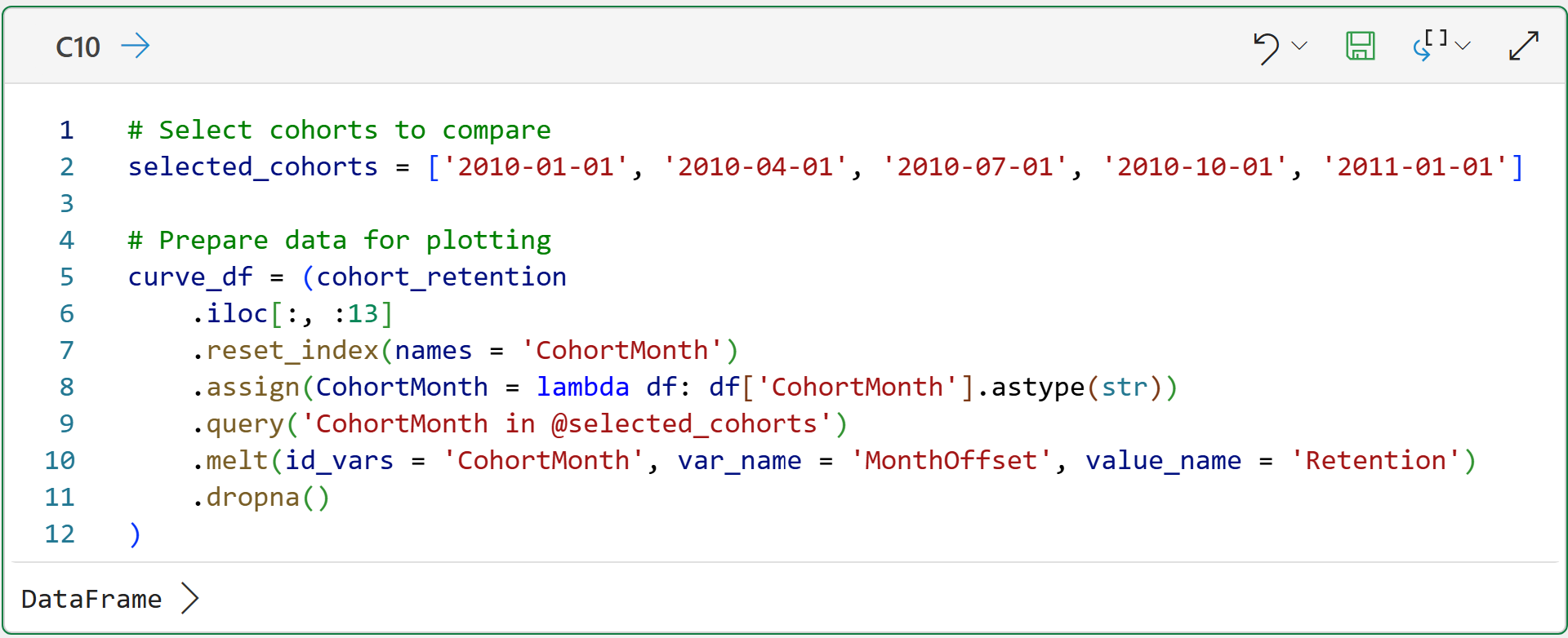
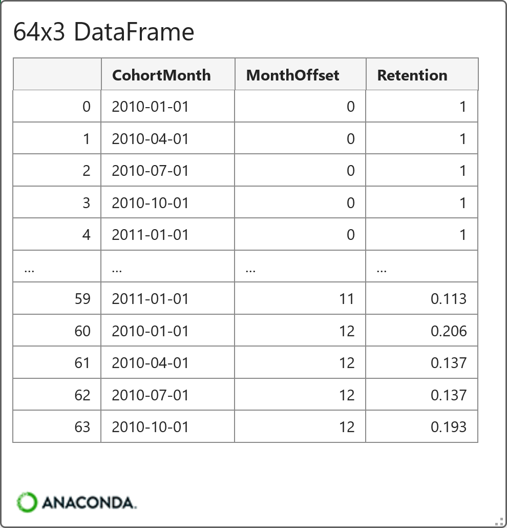
Because adding every cohort to a line chart would make it impossible to analyze, the following code demonstrates a way of selecting a subset of the data for use in a line chart:
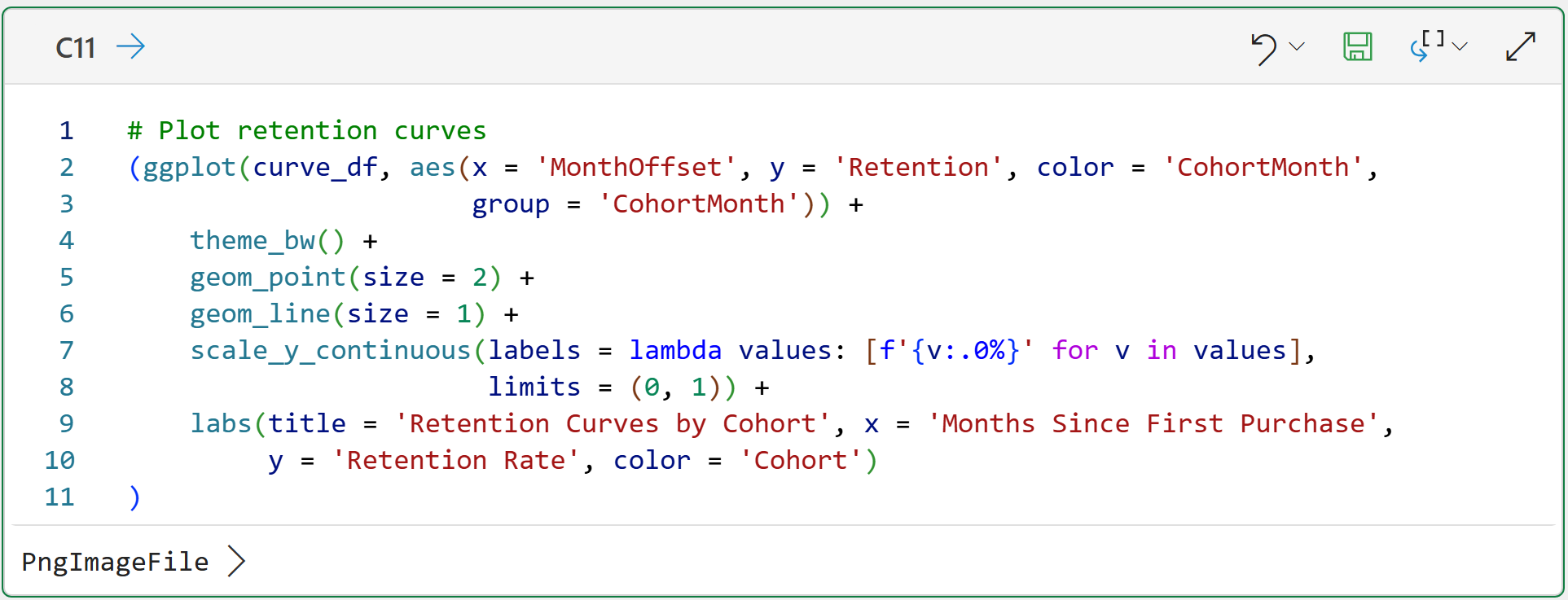
And here's the code for creating the line chart using the mighty plotnine:
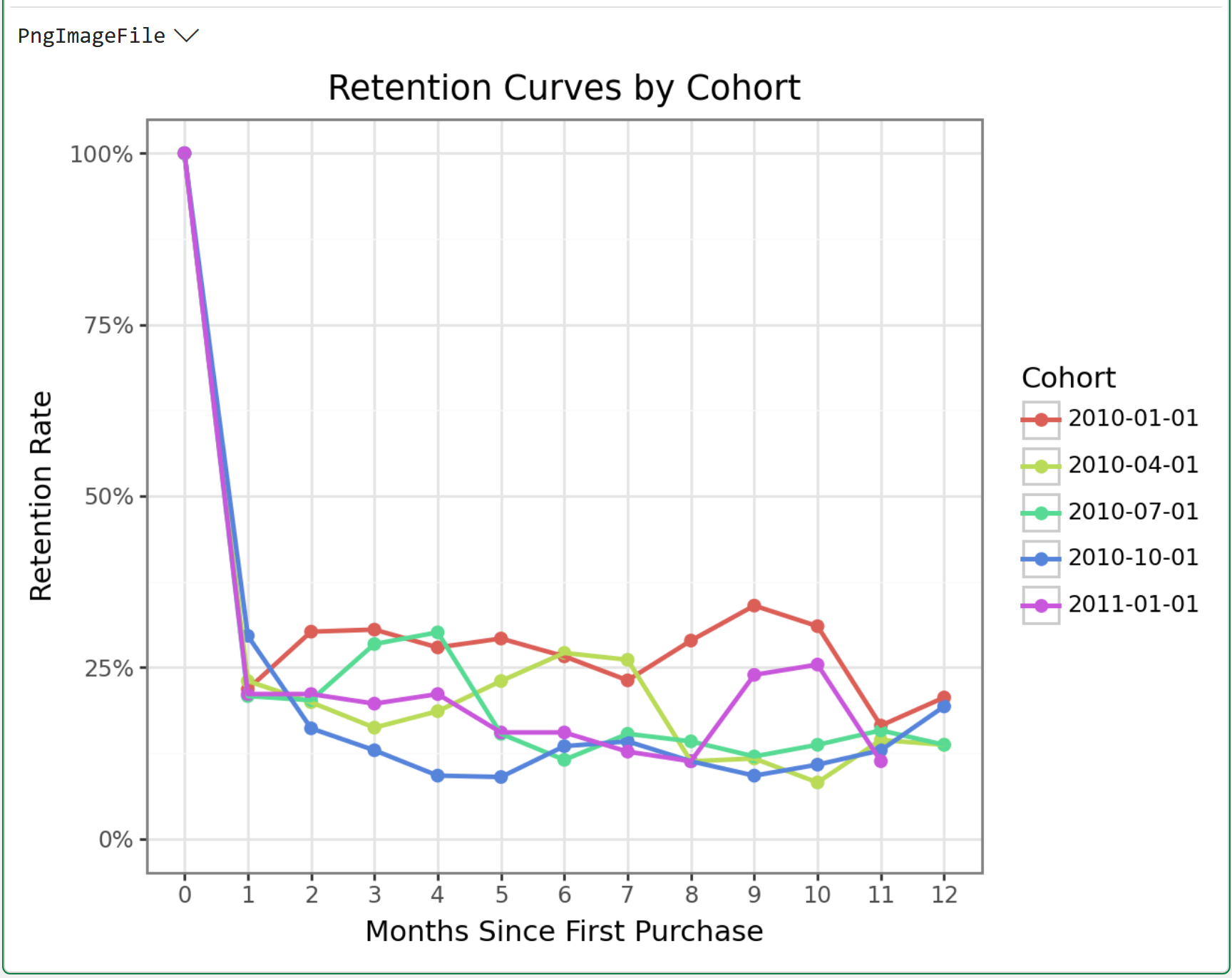
Examine the patterns in these retention curves. It's very common to see the following patterns:
A steep drop in Month 1.
A slower decline through Months 2-4.
An eventual flattening that fluctuates within a consistent range.
The fluctuating within a consistent range is your loyal segment - the customers who have integrated your brand into a regular habit.
That percentage varies by cohort. And that variation matters for CLV.
What This Tells You About Customer Value
Here’s the business translation.
The cohort that retains at 12% after 12 months is worth roughly twice as much in long-run CLV as the cohort that retains at 6%.
Same product. Same price point. Different customer mix or acquisition channel.
If you know which cohorts perform better, and when you acquired them, you can trace that back to the marketing campaign, the channel, or the seasonal context that drove the customer acquisition.
That’s the connection between cohort analysis and acquisition strategy.
And here’s the piece that directly addresses the failure mode we identified in Part 2.
The recency blindness problem was this: the simple CLV formula treated a recently churned customer and an actively purchasing customer as identical, because it only looked at total historical behavior.
Cohorts don’t have that problem. By anchoring to the first purchase month and tracking behavior over a relative time frame, you can see the difference between a customer in Month 2 of their lifecycle and one in Month 14.
Those are very different positions, and cohort analysis keeps them separate.
A Note On Incomplete Charts
Before you move on, there’s one gotcha worth naming.
The most recent cohorts in your dataset will have incomplete data. A cohort that started in October 2011 only has two or three months of observable behavior when the dataset ends in December 2011.
That means their Month 6 and Month 12 retention rates simply don’t exist yet.
When you see NaN values in a heatmap for recent cohorts at high month offsets, that’s why. It’s not missing data in the problematic sense. It’s genuinely unobserved future behavior.
BTW - This is also one of the core challenges in predictive CLV modeling: how do you estimate long-run value for a customer whose history is short?
That’s what Part 5 is designed to address. For now, just be aware that recent cohorts are inherently incomplete.
That's it for this week.
My next newsletter will continue this tutorial series by teaching you a powerful analysis technique, FRM segmentation.
Stay healthy and happy data sleuthing!

Dave Langer
Whenever you're ready, here are 3 ways I can help you:
1 - The future of Microsoft Excel is unleashing the power of do-it-yourself (DIY) analytics using Python in Excel. Do you want to be part of the future? My Python in Excel Accelerator online course will teach you what you need to know, and the Virtual Dave AI tutor is included!
2 - Are you new to data analysis? My Visual Analysis with Python online course will teach you the fundamentals you need - fast. No complex math required, and the Virtual Dave AI Tutor is included!
3 - Cluster Analysis with Python: Most of the world's data is unlabeled and can't be used for predictive models. This is where my self-paced online course teaches you how to extract insights from your unlabeled data. The Virtual Dave AI Tutor is included!